This month New York City celebrates the 50th anniversary of Helvetica, the sans-serif typeface developed in 1957 by Swiss designer Max Miedinger, with the opening of Gary Hustwit’s font documentary on September 12 (film screenings sold out in London so get your tickets fast).
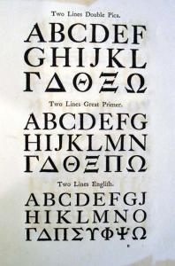
Here in Princeton we honor the serif and the English type designer William Caslon (1692-1766) with the acquisition of Caslon’s 1764 specimen book, the first to be issued in England.
We are not alone in this. Benjamin Franklin used Caslon to set the U.S. Declaration of Independence and George Bernard Shaw famously insisted that all his books must be set in Caslon.
William Caslon was born in the village of Cradley, in Worcestershire, and apprenticed at the age of 13 with an engraving firm. In 1716, Caslon opened his own firm in London, specializing in the engraving of gun locks and barrels. In 1720, Caslon accepted a commission to create a typeface for a New Testament in Arabic and his subsequent Roman typeface was an instant success. Caslon expanded his business into Britain’s first major type foundry. His son, William Caslon (1720-1778), continued the business after his father’s death and the Caslon foundry operated at the same location until 1909.
When Caslon began this business, most English books were printed with imported type. As Simon Loxley points out in The Secret Language of Letters “British rulers severely limited printing and type production as the press was seen as a source of propaganda and unrest. Caslon was one of a handful of founders allowed to cast type … . By 1730 he ‘stemmed the flow of imported type and reversed the flow of traffic’ exporting type to the Continent and to the colonies.”
The merits of Caslon’s types are its regularity, legibility, and sensitive proportions. Caslon helped to modernize the book, making it a separate creation rather than a printed imitation of the old hand-produced book. He made a number of refinements of the Garamond style and created faces that have become traditional and are still much in use.
The history of the Caslon type specimen book has been thoroughly studied by James Mosley in the Journal Printing Historical Society (no. 16 1981/82): “By the late 1740s a set of three sheets was needed to display the full range of the foundry’s types. The making of a specimen book was a logical step. It may have been prompted by the books of continental foundries, such as Lamesle or Fournier, Paris 1742, or Enschedé, Haarlem 1743. Or the model may have been the specimens of the learned presses of the seventeenth century: Typographica Vatican, Rome 1628; University Press, Oxford 1693.
No doubt the new format was adopted both because it permitted more types to be shown and because it conferred an air of permanence and prestige on the business. What is not clear is why the foundry, having decided to produce a specimen book, then issued five versions of it within the space of three years. The details … may be summarized here. Three specimens bear the imprint of Dryden Leach, and the other two that of John Towers. The first, an octavo, is dated 1763. Only one copy of this is known [American Antiquarian Society]. The second is dated 1764. Its title page is reset, but the contents are identical. Both specimens are printed on laid paper. All copies, save one, lack flowers. Leach’s third specimen [now at Princeton], is reimposed in quarto, contains a section of flowers, and is printed on wove paper. The first of tower’s specimens is simply a reprint or reissue of this: its title page is new, though similar, and the contents are identical, down to the placing of signatures. Lastly, there is the specimen of 1766 ….”
