September 2008 Archives

Tweedledee and Sweedledum

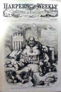
Thomas Nast (1840-1902), “What are you laughing at? To the victor belong the spoils,” Published by Harper’s Weekly, 25 November 1871. Wood engraving. Graphic Arts division GAX Nast Collection

From 1868 to 1871, four Tammany Hall Democrats ran the government of New York City: William Marcy Tweed, alias “Big Bill” or “Boss Tweed”; Peter Barr Sweeny, also called “Brains”; Richard B. Connolly, known as “Slippery Dick”; and A. Oakey Hall, referred to as “O.K. Haul”. It has been estimated that these men stole from $75,000,000 to $200,000,000 from the NYC treasury.

The German-American cartoonist Thomas Nast (1840-1902) referred to Tweed and Sweeny as Tweedledee and Sweedledum, as he waged a campaign to remove the corrupt officials from power through his caricatures in Harper’s Weekly and The New York Times.

Nast’s assault was so sharp and successful that Tweed presented a bill to the State Legislature as an official protest against “an artist encouraged to send forth in a paper that calls itself a “Journal of Civilization” pictures vulgar and blasphemous, for the purpose of arousing the prejudices of the community against a wrong which exists only in their imagination.” There is no doubt that Assembly Bill No. 169 of March 31, 1870, was directed at the “Nast-y artist of Harper’s Hell Weekly—a Journal of Devilization.”

When this did little to stop Nast, Tweed gave orders to his Board of Education to reject all Harper bids for schoolbooks and to throw out those already purchased. More than $50,000 of public property was destroyed and replaced by books from the New York Printing Company (controlled by Tammany Hall).

Harper’s continued publishing Nast’s political cartoons, although Nast moved his family to New Jersey after receiving death threats.

Tweed and his compatriots were finally removed from office in November 1871. One of several celebratory cartoons drawn by Nast depicts Tweed as Marius among the ruins of Carthage, seen above. While Tweed is defeated, the New York Treasury is left demolished and empty.

For more details, see Albert Bigelow Paine, Th. Nast: His Period and His Pictures (New York: Macmillan Company, 1904) Firestone NE 539.N18 P16

Kobayashi Kiyochika

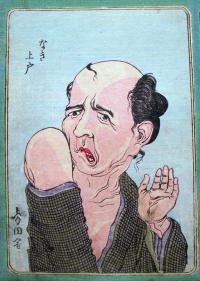
This is a selection of satirical portraits by the Meiji printmaker Kobayashi Kiyochika (1847-1916). Although the complete text has not yet been translated, the work reflects the political cartooning Kiyochika created for the journal Marumaru Chinbun from 1882 to 1883. There is a Western feel to the work, the influence of the English cartoonist Charles Wirgman (1832-1891), with whom he studied. Kiyochika's dependence on commissions for book and magazine illustration ended in 1894 with a spectacular series of 70 triptychs depicting scenes from the Sino-Japanese War, after which he turned to painting as an artistic medium. Graphic Arts division GAX 2008- in process

For information in English, read Henry Smith, Kiyochika: Artist of Meiji Japan (1988). Marquand Library NE1310.K85 S62.

Designing the Brooklyn Bridge

| 1 Comment

The Great East River Bridge, known today simply as the Brooklyn Bridge, opened to the public May 24, 1883. Designed by John Augustus Roebling (1806-1869) and Wilhelm Hildenbrand, the bridge took 13 years to build at a cost of 15 million dollars.

When John Roebling died unexpectedly in 1869 of a foot injury, his wife and sons continued the project. His first son Washington Roebling was also injured and confined to bed. Charles Roebling not only worked onsite but also invented an 80 ton wire rope machine, which made the project a success.

This photograph shows Charles Roebling and Hildenbrand consulting on the bridge. The drawing on the wall is by Hildenbrand. Graphic Arts division, GAX American Photography

The Comic Almanack

| 1 Comment

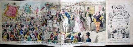
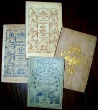
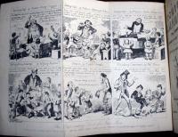
The Comic Almanack. An Ephemeris in Jest and Earnest, containing All Things Fitting for Such a Work by Rigdum Funnidos, Gent (London: David Bogue [etc.], 1835-1853). Graphic Arts (GA) Cruik 1835.81. Presented in memory of DeWitt Millhouser by Mr. and Mrs. William M. Cahn, Jr., Class of 1933.


A man named Rigdum Funnidos is given credit for a number of the issues of the Comic Almanack, but who was he? Brewer’s Dictionary of Phrase and Fable lists Funnidos as “A quick, active, intrepid little fellow, … full of fun and merriment, … all over quaintness and humorous mimicry, ….” Sir Walter Scott gave the name to his publisher, John Ballantyne, after a character in Henry Cary’s, Chrononhotonthologos (Robert Taylor collection 19th-305).

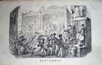
George Cruikshank (1792-1878) also used the name rather than credit himself for the editing (compiling?) of Comic Almanack from 1935-48, when Horace Mayhew took over. Cruikshank served as the principle illustrator for most of the annual’s nineteen years, creating issues “adorned with a dozen of ‘Righte Merrie’ cuts, pertaining to the months, and an hieroglyphic.” Text authors included William Thackeray (1811-1863), Albert Smith, Gilbert Becket, (1811-1856) and others.

Thackeray wrote a commentary entitled “George Cruikshank,” for the Westminster Review, June 1840, which spoke about their project:

Twelve admirable plates, furnished yearly to that facetious little publication, the Comic Almanac [sic], have gained for it a sale, as we hear, of nearly twenty thousand copies. The idea of the work was novel; there was, in the first number especially, a great deal of comic power, and Cruikshank’s designs were so admirable that the Almanac at once became a vast favorite with the public, and has so remained ever since.

…In the earlier numbers of the Comic Almanac all the manners and customs of Londoners that would afford food for fun were noted down; and if during the last two years the mysterious personage who, under the title of “Rigdum Funnidos,” compiles this ephemeris, has been compelled to resort to romantic tales, we must suppose that he did so because the great metropolis was exhausted, and it was necessary to discover new worlds in the cloud-land of fancy.

…it is very difficult to find new terms of praise, as find them one must, when reviewing Mr. Cruikshank’s publications, and more difficult still (as the reader of this notice will no doubt have perceived for himself long since) to translate his design into words, and go to the printer’s box for a description of all that fun and humor which the artist can produce by a few skilful turns of his needle. …thank heaven, Cruikshank’s humor is so good and benevolent that any man must love it, and on this score we may speak as well as another.

More digital images of the Comic Almanack are at http://www.uflib.ufl.edu/ufdc/?g=all&b=UF00078634

Reading Distorted Type

Science 12 September 2008: Vol. 321. no. 5895, pp. 1465 - 1468.

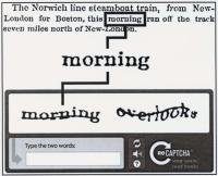
In last week’s issue of Science magazine, Luis von Ahn and his colleagues write about CAPTCHAs, that is Completely Automated Public Turing tests to tell Computers and Humans Apart. An example is seen above, in which an image containing several distorted letters is presented to online users before they purchase tickets or join social networks. Each day, 100 million of these distorted words are decoded and retyped by you and me.

Their research explores whether this human intervention can be used to help such projects as Google books’ digitization of library collections. When the optical character recognition machines cannot decipher particular words, CAPTCHAs could be used to solve the distortion. Therefore, every time you order something online, Princeton and other libraries would benefit.

The complete text can be read at: http://www.sciencemag.org/content/vol321/issue5895/cover.dtl

The Pantograph

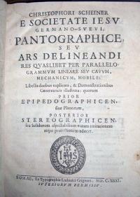
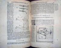
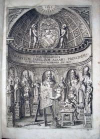
Christoph Scheiner (1575-1650), Christophori Scheiner, e Societate Iesu Germano-Sueui, Pantographice, seu, Ars delineandi res quaslibet per parallelogrammum lineare seu cauum, mechanicum, mobile (Romae: Ex typographia Ludouici Grignani, 1631). Graphic Arts Collection (GAX) 2004-2933N

If you want to enlarge one of these images, you can just click on the thumbnail and a larger image will appear. In the seventeenth century, for the first time, artists had a device, called the pantograph, to help them mechanically copy a design on an enlarged or reduced scale.

Christopher Scheiner, a German Jesuit, was responsible for designing and building the first pantograph in 1603. An illustration of the device can be seen in his 1630 book, Rosa ursina Sive Sol, along with other instruments he invented including a refracting telescope. The following year, Scheiner published a manual on the construction and use of the device, entitled Pantographice, seen here.

There are several types of pantographs, each consisting of parallel and intersecting rods. Scheiner’s frontispiece engraving depicts it being used both horizontal and vertical. To make your own pantograph, see http://users.hubwest.com/hubert/mrscience/pantograph.html

A Murder Mystery Illustrated by A.B. Frost

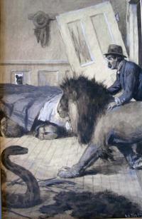
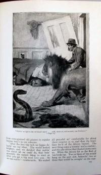
A.B. Frost (1851-1928), illustration for “On the Altar of Hunger” by Hugh Wiley (Scribner’s Magazine, August 1917, p. 177). Ink wash with gouche highlights. Graphic Arts division GAX 2008-

The American artist Arthur Burdett Frost produced illustrations for nearly 100 books from 1876 until his death in 1928. He worked alongside Howard Pyle and Frederic Remington for the leading publishers of the day, including Harper & Brothers and Scribner’s. While he made his living primarily as a commercial artist, Frost studied painting with Thomas Eakins and William Merritt Chase at the Pennsylvania Academy of the Fine Art and lived for awhile in Paris, hoping for success as a “serious painter” [his words]. Although he never gave up painting entirely, in 1914 Frost and his family returned to the United States and he resumed work as an illustrator.

In 1917, Frost wrote “… am going to take up caricaturing with a view of getting into the syndicate job. If it all goes at all it means better pay that I could get in any other way. Caricature is with me a separate thing from my life. I can draw absurd things that amuse others but do not affect me. I am wretchedly unhappy and always will be but I can make “comic” pictures just as I always did.”

One of the commissions he recieved that year was to illustrate a short story by the mystery writer Hugh Wiley. Wiley is best known today for his character James Lee Wong, who was the focus of a series of stories in Collier’s magazine and then, in movies as played by Boris Karloff. Wiley’s short story “On the Altar of Hunger,” illustrated by Frost, appeared in the August issue of Scribner’s Magazine, and later, unillustrated, in 50 Best American Short Stories 1915-1939 edited by Edward O’Brien (New York: Literary Guild of America [1939]) Firestone Library (F) 3588.684.2

Page 177 of Scribner’s shows the published version of Frost’s ink wash drawing, now in the collection of graphic arts. The choice of blue is interesting, since in the 20th century, magazine illustrators made corrections in blue, which could then be screened out of the published image. Here those elements are included as an added tone.

Russell Means and The Great Mystery

| 2 Comments
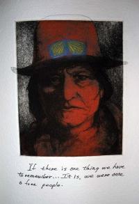
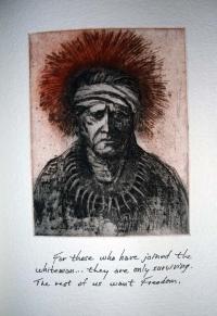
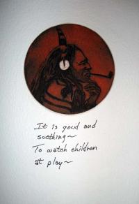
Russell Means (born 1939), The Great Mystery [S.l.]: American Indian Mystery Press, 1997. Graphic Arts division GAX Oversize 2008-0030F.

When the Oglala Indian Russell Means finished his autobiography, Where White Men Fear to Tread (Firestone Library (F) E99.O3 M386 1995), he found there were things he left out. In particular, Means wanted to say more about the spiritual side of his heritage, a single creative life force sometimes called the Great Mystery.

Means wrote a series of short commentaries and his hand-written texts were converted to copper plate etchings. The words were matched with Native American portraits by Peter Bogardus and the plates printed in colors in Hadley, Massachusetts at Horton Tank Graphics. The Great Mystery was completed in 1997 but failed to reach a good distributor or a public. More than ten years later, a copy of this obscure project found its way to graphic arts.

For more about Means, see his website and personal blog: www.russellmeans.com. To see other work by Bogardus, see Touba - New York (Graphic Arts Collection (GAX) Oversize 2008-0012E)

Ticket to Pasquin: A Dramatick Satire On The Times

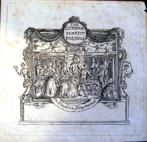
The Author’s Benefit Pasquin, etching, 1736 or after. Formerly attributed to William Hogarth; currently attributed to Joseph Sympson. Graphic Arts division GA 2008- in process

This print appears to be an admission ticket for a benefit performance of Henry Fielding’s Pasquin, first performed in April 1736. It depicts a stage scene with seven performers, a dog and a cat, and in the background, two tightrope walkers accompanied by an ape; framed with a satyr on either side.

Originally attributed to William Hogarth (a friend and colleague of Fielding), the etching is a forgery. It was later attributed to Joseph Sympson, although that attribution is also questioned by some historians. In particular, Ronald Paulson wrote two different explanations for this print in Hogarth’s Graphic Works, if you look at both the 1965 and 1989 editions (Marquand Library (SA) ND497.H7 A35 and ND497.H7 A35 1989q).

Henry Fielding (1707-1754) was a British writer, playwright and journalist. His satirical comedy Pasquin; A Dramatick Satire On The Times Being The Rehearsal Of Two Plays: Viz., A Comedy Called The Election, And A Tragedy Called The Life And Death Of Common Sense, opened at London’s Haymarket Theatre.

A year earlier, Fielding had taken over management of the Little Theatre in the Haymarket and formed a company he called “Great Mogul’s Company of English Comedians.” That winter, he launched Pasquin to enormous success. His play was a brutal satire of the contemporary British government under Sir Robert Walpole, who retaliated with the Theatrical Licensing Act of 1737 and effectively ended Fielding’s brief West End career.

It may have been this political drama that built a market for the forged Fielding ticket.

Mikhail Magaril

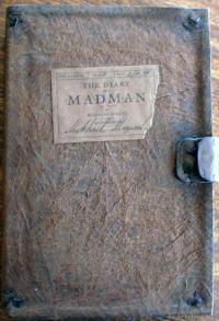
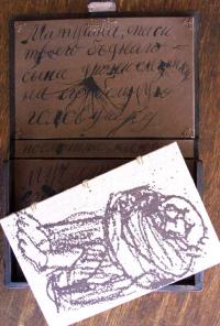
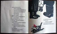
Nikolai Gogol (1809-1852), The Diary of a Madman. Translation of Zapiski sumasshedshego by Constance Garnett (1862-1946); illustrated by Mikhail Magaril (New York: Summer Garden Editions, 1998). Edition of 100 copies. Graphic Arts division, GAX 2008- in process.

This edition of Gogol’s classic was designed, printed, and bound under the direction of the Russian-American artist Mikhail Magaril and published under his own imprint, Summer Garden Editions. The drypoint plates were printed with masterprinter Kathy Caraccio and the letterpress at the Brooklyn studio of Peter Kruty.

“Upon arriving in New York,” wrote Magaril, “I was connected to the Center for Book Arts, where I continued to work as an apprentice for seven years. Though I had a master’s degree from the Moscow Graphic Art School, I realized that I still had a lot to learn, especially in terms of physically making a book, including how to set type, print it, and make a binding. …I believe it is preferable … to make everything by hand. The work of a book artist can be compared to the work of an actor. The actor is constantly haunted by each new role he accepts. The same is true of a book artist.”

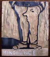
Princeton is fortunate to own seven of Magaril’s books, including his first illustrated book: Hindrance by Daniel Kharms. Produced in a limited edition of 20 copies, the printed and collaged pages were hand-sewn by Magaril into a coptic binding with two carved woodblocks for its cover.

Kharms, Daniil (1905-1942), Hindrance. Translated by Julie Magaril; illustrated by Mikhail Magaril (New York: Summer Garden Editions, 1998). Graphic Arts division GAX 2008- in process

Basic Three Color Printing

Frederick Martin Sheldon, The Practical Colorist; a Pathfinder for the Artist Printer (Burlington, Vt., The Owl Press, 1900). Graphic Arts division GAX 2008- in process

A

“Believing that in the heart of every printer there is a strong desire to rise above the common level, out of the lethargic indifference of the past, into the joy of the aggressive artist printer, I have assembled the matter in The Practical Colorist as a means to this end. This book is not a text-book on the science of light and color … The book treats of nothing but the simple details essential to good work, but to one who aspires to success in illuminating, these details are, of all things, most valuable. In fact, The Practical Colorist, from beginning to end, is one earnest plea, by precept and illustration, for simple, plain, neat, and readable type and color effects.”—Preface, Frederick M. Sheldon

B


A/B

C


A/B/C

The Book of Questions

Pablo Neruda (1904-1973), The Book of Questions (Pasadena, Calif.: Archetype Press, Art Center College of Design, 2001). Edition of 55 copies. Graphic Arts division GAX 2008- in process

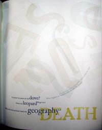
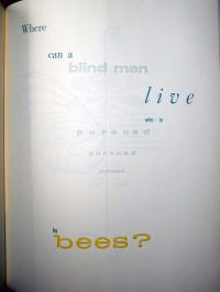
In 1973, a few months before his death, Neruda wrote over 70 poems based on simple, unanswerable questions. Libro de las preguntas (The Book of Questions) was published the following year. In 2001, printers at the Art Center College of Design’s Archetype Press were inspired to reproduce Neruda’s words as concrete poems in a virtuouso feat of creative typesetting. “This book,” states the introduction, “attempts to portray excerts from Pablo Neruda’s The Book of Questions, in a manner whereby the form and shape of both typography and the white space of the page combine to enrich the subtle nuances within the poet’s language.”


In which window did I remain watching buried time?


Rivers Pollution Prevention Act 1876

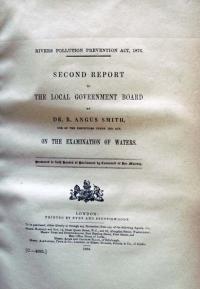
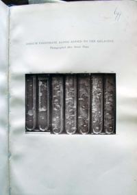
R. Angus Smith (1817-1884), Rivers Pollution Prevention Act, 1876. Second Report to the Local Government Board (London: Eyre and Spottiswoode, 1884). Illustrated with woodburytypes. Graphic Arts division GAX 2008- in process.

The Scottish environmental scientist Dr. Robert Angus Smith (1817-1884) studied air and water pollution, coining the term “acid rain” in 1852. After working at the chemical laboratory at the Royal Manchester Institution, Smith was named the first Alkali Inspectorate by the Alkali Act of 1863. He went on to publish numerous texts on the control of urban pollution, most notably Air and Rain. The Beginnings of a Chemical Climatology (London: Longmans, Green, and co., 1872). Recap 85083.863

In 1876, an Act of Parliament was passed to attempt to control London’s water pollution. Smith was appointed the inspector to uphold the new laws. His methods for determining the number of microbes in water led to significant development in environmental science and law.

Seven mounted woodburytypes of Smith’s experiments were used to illustrate the 1884 second edition of Smith’s report to the government board. The prints were made by Vincent Robert Alfred Brooks (1814-1885) a lithographer who purchased the patent for Woodbury’s photo-relief process in 1879 and specialize in this method of book illustration through the turn-of-the-century.

Who Likes Our Biscuits?

| 1 Comment

Album des célébrités contemporaines (Nantes: Lefèvre-Utile, ca. 1903). Graphic Arts division GAX 2008- in process

Over 100 years ago, the French biscuit manufacturer Lefèvre-Utile (LU) promoted its cookies with endorsements from the leading celebrities of the Belle Époque. Embossed chromolithographed cards were issued with a prominent figure’s black and white portrait and their brief testimonial to LU’s cookie quality, set within a colored scene that is thematically linked to the personality portrayed.

The public was encouraged to collect these cards and LU produced elaborate art nouveau albums for that purpose. Each album carried a list of all the celebrities endorsing LU, which included artists, actors, writers, musicians, composers, and aviators. Princeton’s album holds 48 cards in preprinted mounts with an additional 10 laid in, including cards for Yvette Guilbert, Cleo de Merode, Coquelin Aine, Jules Massenet, and George Courteline.

Today, LU cookies are marketed with less fanfare under the Kraft Foods umbrella.

Rowlandson's Distillers

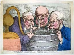
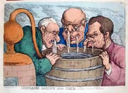
Thomas Rowlandson (1756-1827), Distillers Looking into Their Own Business (London: Thos. Tegg, 111 Cheapside. October 10, 1811). Etching. Inscribed in plate: Price one shilling coloured. Tegg no. 100. c.1 Gift of Dickson Q. Brown, Class of 1895. c.2 Gift of Bruce Willsie, Class of 1986. GA 2006.00684

Thomas Rowlandson was one of several prolific artists who sold satirical designs to the London publisher Thomas Tegg (176-1846). Tegg's bookshop was well-placed at 111 Cheapside--known for its cheap reproductions of remaindered or out-of-copyright books. He often reissued the same plate over several years, each time hand colored by whatever colorist was on staff at the time. We often collect several issues of the same image, to compare the result of different coloring.

Rowlandson's print is one of many commenting on the underground distribution of gin in London after the Gin Act of 1751, which prohibited distillers from selling to unlicensed merchants and charged high fees to those with a license. This led to hundreds of illegal stills across the city. The alcohol was often flavored with turpentine . . . or anything else that was handy.

These operations closed in 1830, when the Duke of Wellington's administration passed the Sale of Beer Act, removing all taxes on beer and allowing retail sale of beer on payment of a two-guinea fee.

Mammoth Inauguration

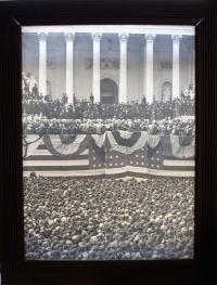
GA 2008-01237

Although it may be difficult to tell from a thumbnail, this is a mammoth plate (23 x 17 inch) collodion on glass positive photograph of Grover Cleveland’s 1885 inauguration as the twenty-second president of the United States. The spectacular image represents the end of one era and the beginning of another for American photography.

Mammoth glass plates had been used with great success since the 1860s when Carleton Watkins and other members of the government expeditions carried them through the West. Commercial photographers in the East, such as Mathew Brady, also used mammoth plates to make celebrity portraits on a grand scale.

However, for most photographers, glass plates were heavy, difficult to handle, and easily broken. Even with the development of an emulsion-coating machine in 1879, there was a demand for better, cheaper materials to support the light-sensitive chemistry. In 1885, George Eastman introduced his Eastman American Film and in 1888, offered a camera that held a pre-coated roll of his flexible film. Now anyone who could afford to buy the camera could make photographs.

It is not surprising to find this seminal photograph at Princeton. When he retired from office, Cleveland chose Princeton, New Jersey, for his home and served for a time as a trustee of Princeton University. When he died in 1907, he was buried in the Princeton cemetery of the Nassau Presbyterian Church.

Cleveland’s papers are available in the Grover Cleveland collection, 1860-1907 (Manuscripts Collection MSS C0237). In addition, the books from his personal library are now part of Princeton’s rare books collections, including his copy of the 1885 Message from the President of the United States to the two Houses of Congress at the commencement of the first session of the forty-ninth Congress (Rare Books (Ex) CL 1090.24.9).

For more information on Cleveland’s connections with Princeton, see http://etcweb.princeton.edu/CampusWWW/Companion/cleveland_grover.html

The Coming of the End of the World


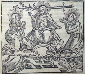
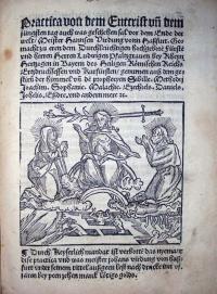
Johann Virdung (ca.1465-ca.1535) Practica von dem Entcrist un[d] dem jungsten tag auch was geschehen sal vor dem Ende der welt (Ohne Ort: Speyer, Anastasius Nolt, 1525). Graphic Arts collection GAX 2008- in process

Johann Virdung was a mathematician and astrologer. In the early sixteenth century, he was working at the court of the Elector Palatine and making prognostications, such as this, on the Antichrist and the coming end of the world.

In the compelling title page woodcut, Christ is seen with a sword on the right side of his head and a lily on the left. The lily signifies innocence and mercy. The sword is a symbol of guilt and punishment. Together they represent the final judgment for the poor souls seen below, some being pushed into hell and some being saved.

Recent Comments

  • Howard Coblentz: I have a round seal shaped like a pear a read more
  • John Overholt: Wikipedia's entry for Sir Francis says: "Throughout Baring's lifetime his read more
  • Serge Rodrigue: It is a precious thing you have a book from read more
  • Colin Wicks: I have a copy of “A Round Game.” And it read more
  • Laurence Hilonowitz: I was a Customer, Friend of Bob Wilson. I Live read more
  • allen scheuch: Absolutely STUNNING! Those colors, those designs made my day! Thanks, read more
  • Olivier: Hello Diane, If you are still looking for an examplare read more
  • Stella Jackson-Smith: I have a framed picture by A.Brouet, signed with the read more
  • John Podeschi: I remember Dale fondly from my days at Yale (1971-1980). read more
  • Joyce Barth: I have some or all of this same poem. I read more