This remarkable story and twenty-one pochoir illustrations are the work of Yan Bernard Dyl (dates unknown). He printed them from pochoir stencil at the Jacomet Studio, Paris, under the sponsorship of the print publisher Daniel Kahnweiler (1884-1976). Fearing the anti-German sentiment in Paris, Kahnweiler changed the name of his gallery and publishing house to Simon Kra in order to continue publishing uninterrupted.
April 2010 Archives
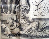
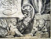
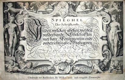
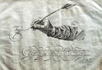
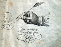
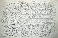
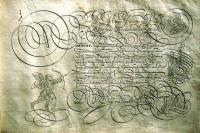
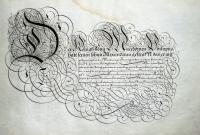
Jan van den Velde I (1568-1623), Spieghel der schrijfkonste (Mirror of the Art of Writing): in den welcken ghesien worden veelderhande gheschriften met hare Fondementen ende onderrichtinghe Wtghegeven (Amsterdam: Willem Iansz, inde vergulde Zonnewyser, 1609). 25 x 34 cm (oblong folio). Fifty-seven engravings including the engraved title page, an engraved portrait, and fifty-five leaves of calligraphic samples. *Note the putti pulling goose feathers to make writing pens.
Thanks to the assistance of the Friends of the Princeton University Library, graphic arts recently acquired a rare, complete third edition of this important Schrijfmeesterboek (writing-master’s book) from the Golden Age of Dutch art. Written and designed by Jan van den Velde I, this edition was printed by cartographic publisher Willem Janszoon Blaeu (1571-1638) with a title page cartouche designed by the artist and art historian Carel (Karel) van Mander (1548-1606) and engraved by the engraver and publisher Jacob Matham (1571-1631), along with fifty-five sample plates engraved by Simon Wynhoutsz Frisius (also written Vries, ca. 1580-1629).
The first edition appeared in 1605 published by van den Velde’s brother-in-law, Jan van Waesberghe II, in Rotterdam. The same year a second edition was published in Amsterdam by the printer and publisher Cornelis Claesz. The third edition was published by the no less famous printer Willem Janszoon Blaeu, after Blaeu acquired the original plates from the Claesz heirs. For an unknown reason, an extra plate by van den Velde has been added to this particular copy.
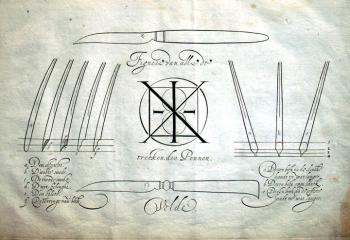
From the sixteenth to the eighteenth centuries, two types of writing books predominated in Europe: the writing manual to offer instruction in how to make, space, and join letters as well as how to choose paper, cut quills, and make ink; and the copybook with engraved plates of writing models to be copied. Writing manuals and copy books are a top priority for library graphic arts collections, including Princeton University, to serve as a resource for the international study of letterforms.
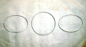
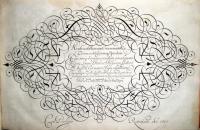
Van den Velde’s volume is both a writing manual and a copy book, offering instructional texts as well as an extensive set of model plates with examples of all the different hands in use throughout Europe at that time. Written in Dutch, German, French, English, Italian, Spanish, and Latin, van den Velde not only covers the alphabets but also includes ornamental penwork confirming his dazzling mastery in the fusion of script with the calligraphic decoration.
As with many of these beautiful writing books, Spieghel is at once an artifact offering exceptional examples of high Dutch engraving and a research tool for undergraduate and post-graduate instruction in the history of letterform.
To his credit, van den Velde himself provides analysis as to the type of study his book would or should receive. In part three, he begins with a sustained discussion of the national hands that function both as treatise and manual, defining the criteria of mastering penmanship and diagramming, stroke by stroke, how different alphabets are formed. He justifies his reputation by noting that mastery consists not in specialization but in the ability of wield multifarious hands “I know well that what I teach here will be examined scrupulously by many fastidious souls, who will gravely proof my writing specimens as well, preferring to find fault rather than improve; I pray them to observe the good differentiation of hands before blaming the liberality of my pen, for though there will be those who have flown beyond the limits of my instruction, so they will find my book well governed, containing neither confusion nor scandal. Poets have their license, philosophers their exceptions, and painters their ornaments, so too with the pen, by degrees the quick and supple hand spreads its wings wider than that hand which writes an upright or heavy letter.” (Translated by historian Walter Melion in his wonderful article “Memory and the Kinship of Writing and Picturing in the Early Seventeenth-Century Netherlands,” Word & Image 8, no. 1 (January-March 1992))
Stanley Morison, writing in Calligraphy 1535-1885, commented, “The Spieghel’s format is of exceptional size. Van den Velde’s book is a magnificent specimen, not only with regard to the specific period it represents, but also in relationship to the entire history of calligraphy as an art. Of special note are the plates containing the Gothic letters, showing unique mastery in the fusion of the script with the calligraphic decoration.” Walter Melion wrote, “In scale, richness of ornamentation, and sheer number of specimens, the Spieghel is the most elaborate of these exemplaer-boechen.” Victor I. Carlson, in his essay for the Baltimore Museum’s 2000 Years of Calligraphy summed it up, “Van den Velde’s copy-book … is usually considered the most important work on calligraphy to be printed in Holland.”
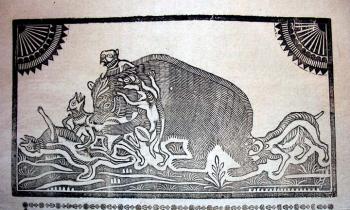
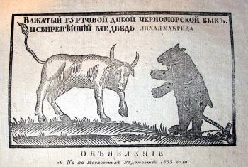
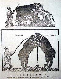
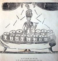
Graphic Arts recently acquired thirty-two announcements or fliers inserted as advertising supplements in the Moskovskie vedomosti (Moscow News), one of Russia’s largest newspapers. They include announcements of bull and bear baiting, lottery results, horse auctions, new medicines, mechanical theatricals, and new books, ranging in date from 1820 to 1835. While issues of the newspaper have been archived and microfilmed, these supplements were often discarded and so, have become rare ephemera sheets.
Moskovskie vedomosti was established by Moscow University in 1756 and ran continuously for over 150 years. The newspaper began by publishing once a week, went to twice a week in 1812, and three times a week in 1842. It was closed by the Bolsheviks on November 9, 1917, two days after the October Revolution.
Eight of the notices are illustrated with woodcuts, as seen here. Several exhibitions and public performances are noted, including a Moscow French theater show featuring horse-riding, drumming, and gymnastics. A performance of the mechanical theater of Kuparenko (Iordache Cuparencu) and Krames is announced, where their newest automated instrument, the “buzuton” would be seen. A fight between a wild Black Sea bull and the bear Evil Makrida was advertised on March 12, 1833, to which the audience was invited to bring their own dogs to participate if the bear was not killed during the performance.
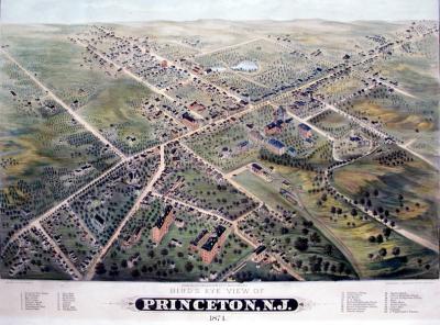
Bird’s Eye View of Princeton, N.J., 1874. Lithographed by Breuker and Kessler after a design by H. H. Bailey. Published by Charles O. Hudnut. GC047 Princetoniana Collection.
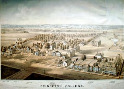
Princeton College, Princeton, N.J., 1875. Lithographed by Thomas Hunter, after a design by W. M. Radcliff. Published by Charles O. Hudnut and also called Hudnut’s Aerial View. GC047 Princetoniana Collection.
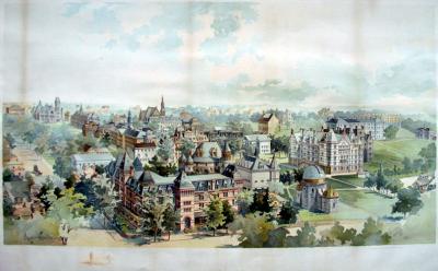
Kyes and Woodbury (John F. Kyes, dates unknown, and Charles Herbert Woodbury, 1864-1940), Untitled [Aerial view of Princeton University campus], 1895. Lithograph. Published by George S. Harris and Sons, and reproduced in Harper’s Weekly on January 26, 1895. GC047 Princetoniana Collection. *Note: Kyes is correct, not Keyes as is sometimes seen.
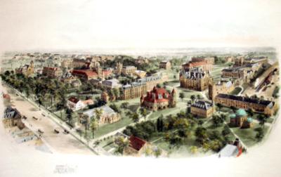
Princeton University, 1906. Hand-colored engraving after a watercolor by Richard Rummell (1848-1924). Commissioned and published by Littig and Company. GC047 Princetoniana Collection. Rummell made a number of watercolors of Princeton University (see also below), which were reproduced in full color, sepia, and/or black and white prints.
Princeton University, ca. 1920. Collotype after a watercolor by Richard Rummell (1848-1924). Commissioned and published by Littig and Company. GC047 Princetoniana Collection.
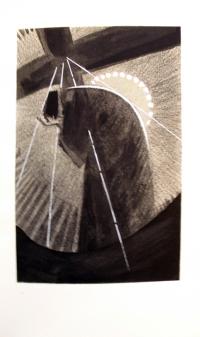
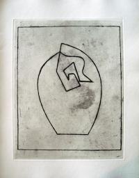
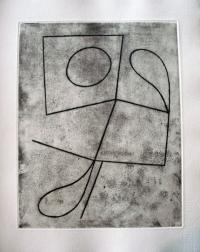
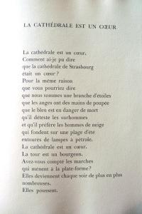
Jean Arp (1886-1966), Vers le blanc infini [Toward the Infinite White] (Lausanne, Paris: La Rose des Vents, 1960). Eight etchings with aquatint printed by Georges Leblanc; letterpress poems printed by Féquet et Baudier. Copy 395 of 499, signed by the artist. Graphic Arts GAX 2010- in process
In the last years of Arp’s life, he created two beautiful livres de peintres. Ver le blanc infini begins with an etching, followed by a poem, followed by an etching, and so on. Eight poems interspersed with eight prints. Neither is the print an illustration of the poem, nor is the poem a reaction to the print. The works were created by the same man and represent his late period art, but are in no way an integration of image and text. In this way, Arp obstructs the convention of the livre de peintre just as the prints and poems confound his self-defined practiced of automatic (free-conscious) writing and drawing.
Blanc et rouge. Design by Paul Iribe (1883-1935) and text by Georges Montorgueil (1857-1933). (Paris: Draeger frères, 1930). Graphic Arts GAX2001 -in process.
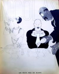
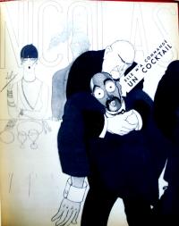
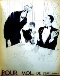
Graphic Arts recently acquired three rare promotional wine catalogues from the Parisian merchant Nicolas. Each is beautifully designed by Paul Iribe, who was best known for his Art Deco costume, furniture, and fabric designs. Iribe began his career as a cartoonist and humorist. Work as an illustrator for French periodicals such as Le Temps, Rire, Sourire, and L’assiette au beurre, led to commissions in fashion illustration, most notably designing for Paul Poiret and his 1908 Les Robes de Paul Poiret.
These wine advertisements were done shortly after Iribe returned to Paris after working in Hollywood from 1914 to 1929, where Cecil B. De Mille is quoted as saying Iribe was the best Art Director he ever worked with.
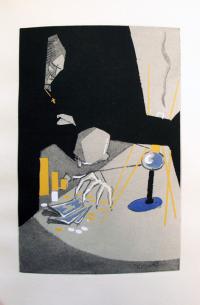
The first catalogue, Blanc et Rouge, is set in a Paris jazz club and written entirely in dialogue, instructing the consumer to choose a French wine and stay away from other drinks.
Rose et noir. Design by Paul Iribe (1883-1935) and text by René Benjamin (1885-1948). ([Paris]: Etablissements Nicolas, 1931). Edition of 500. Graphic Arts GAX2010 -in process.
The second catalogue, Rose et Noir, has an odd storyline for a wine advertisement. Its narrative follows newlyweds through a downward spiral, brought on by the effects of too many American cocktails (and not enough French wine). Laid in is a booklet written by René Benjamin entitled, “Dialogue moderne en trois temps et trois cocktails” (Modern Dialogue in Three Time and Three Cocktails).
Bleu blanc rouge. Design by Paul Iribe (1883-1935). ([Paris]: Etablissements Nicolas, Draeger Frères, 1932). Edition of 520. Graphic Arts GAX2010 -in process.
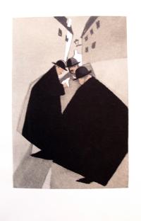
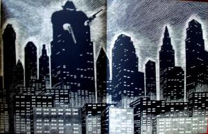
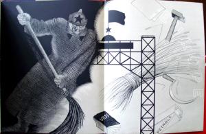
The final volume, Bleu Blanc Rouge, has a cover printed in the colors of the French flag. Large folding plates with striking black and white designs argue against foreign drinks such as Russian vodka, German beer, British whiskey, and American Blue Rock mineral water. French wine again comes to the rescue in the end.
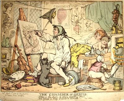
Described by M. Dorothy George in the Catalogue of Political and Personal Satires in the British Museum as follows:
“In a squalid room a man in a frenzy of inspiration, stern and intent, sits at an easel painting on a canvas on which is the large head of a (?) minatory Hebrew prophet. He wears a shirt with one tattered boot and one slipper, and a cloth tied over his head. In his left hand is a pen, and he appears unconscious of a large cat which claws at his bare legs. His pretty wife sleeps with a carefree expression on a make-shift bed (across which his breeches are thrown), while a naked infant beside her pours the contents of a bottle into a glass. On the table are coffee-pot, &c. An older child, almost naked, sits in a tub facing the fire plying a pair of bellows and is in great danger from a kettle and a red-hot poker. The other pursuits of the genius are indicated by two large books, on which he rests a foot, a violin and a French horn, a syringe, a pair of scales, a retort standing on a small furnace; a classical bust on a bracket. A cord stretches across the room on which hang tattered stockings and a piece of drapery. On the wall hang a sword and tricorne hat, with three prints: ‘Araeostation’ [sic], a balloon ascending, reminiscent of Rowlandson’s ‘Aerostation out at Elbows …’; a woman ballet dancer, and an ugly profile head inscribed ‘Peter Testa’. Above the fireplace (right) are a string of onions and a bunch of tallow dips. A dish of food with knife and fork is on the floor.”
*Note, what is the youngest child getting ready to drink?
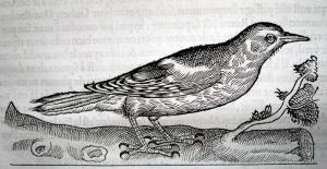
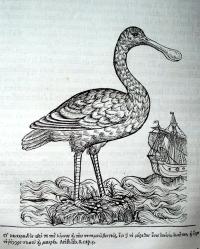
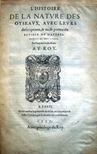
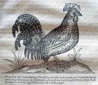
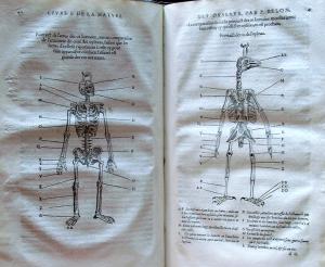
Pierre Belon studied medicine in Paris and became the pupil of the botanist Valerius Cordus at Wittenberg. When Cordus died in 1544, Belon returned to Paris and came under the patronage of François de Tournon, who subsidized his study and extensive travel. With this support, Belon prepared a book on fish in 1551, trees in 1553, and this bird study in 1555.
According to Ruth Mortimer, “Belon’s text, as one of the first of its time to be based on direct observation and original drawings, is a major work in the field of natural history…” A pioneer in comparative anatomy, Belon attempted to match the names of birds used by Aristotle and Pliny with the species then in France (hence the captions in Greek). The book is one of the first ornithological compendiums to be based, in part, on field observations and many of the woodcut bird portraits were taken from actual specimens.
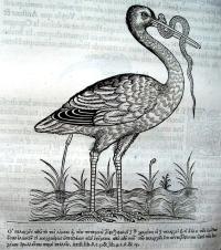
There were two issues of this book in 1555, divided between publishers Gilles Corrozet, who held the privilege, and Guillaume Cavellat. Belon, in his address to the reader, states that various artists contributed to the illustrations, although he names only Pierre Goudet (i.e. Pierre Gourdel). Blocks from this work were used again in 1557 for the first part of Belon’s Portraits d’oyseavx, animavx, serpens, …, also published by Cavellat.
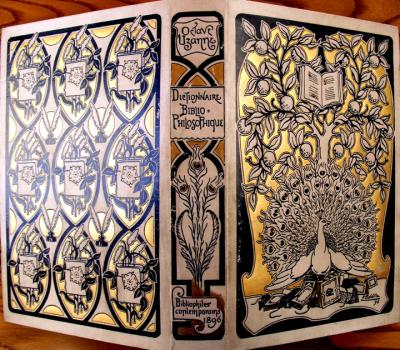
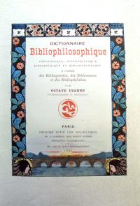
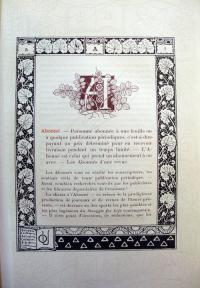
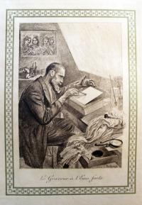
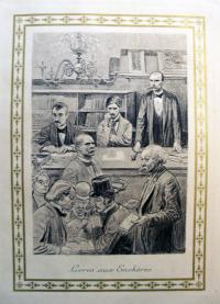
Octave Uzanne (1851-1931) loved books. Long before Forest Gump, Uzanne compared a good book to a superb box of chocolates. He read them; he wrote, edited, and designed them; and he collected them. Uzanne founded several small literary magazines including L’Art et l’idée and Le Livre moderne as well as founding the Société des Bibliophiles Contemporaines (followed later by the Société des Bibliophiles Indépendants).
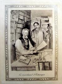
When he was forty-five, he prepared this dictionary to all aspects of the book world, including authors, illustrations, bindings, paper, and much more. Note below right “Un Auteur qui désire garder l’anonyme” (the author who wishes to remain anonymous), which is a portrait of Uzanne.
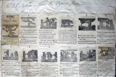
A large receipt book for John Fowler’s (later called Caxton) Printing Offices in Leicester, Great Britain, was recently acquired. Through its more than 350 pasted-down items relating to 50 printing firms and around 350 specimen woodcuts, the collection offers a comprehensive view into a provincial Victorian printing office. The volume is divided into two parts. The front contains fifteen leaves of woodcut samples and the other fifty-nine leaves are filled with receipts and other business items including information on trade with leading type founders, engravers and merchants of presses and other printing equipment within the British printing trade, both in London and the provinces.
The volume came with a well-researched history, which I quote in part here:
“The Leicester firm called towards the end of its existence Caxton Printing Offices, was established according to its letterhead in 1816 but probably at least two years before that. The earliest references in this collection give the proprietor’s name as Thomas Gregory (not in BBTI). By 1825, it was in the hands of John Fowler (BBTI, 1812-1845) passing, around 1846, to his eldest son John Smith Fowler (BBTI, 1846-1884). Most of its few publications were of a religious nature and the Fowlers were clearly dissenters, with the father publishing A Methodist Magazine, conducted by the camp-meeting Methodists known by the name of Ranters, called also Primitive Methodists… One of John Smith Fowler’s brothers, William, traded in St Martin’s, Leicester, as ‘Son and Successor to the late John Fowler,’ ‘General Printer, Bookseller, Stationer, and Book-binder.’”
“The collection reflects all aspects of the trade from ink, paper and binding, to the carpentry required for fitting out an office. Most of the bills are on printed letterheads and forms but some are handwritten, often with a signed acknowledgement of receipt of payment and several with other communications. There are numerous letters and printed circulars, price lists and advertisements, some with illustrations of presses by Clymer & Dixon; Harrild; S. & T. Sharwood; Sherwin, Cope & Co. Many of the letterheads are interesting examples of Victorian graphic design, exhibiting the care one would expect from members of the printing trade.
A couple of items of correspondence, responding to contested bills indicate a contentious streak in the younger Fowler. ‘[W]e wish to meet you as fair as possible,’ the firm of Caslon informs him in 1868. The collection also gives hints of the change in the economic climate. ‘Times are not very good, but I think you are disposed to make them worse,’ Thomas writes in 1844; and in 1868 Rowland Wood of Austin Wood & Co. writes: ‘I hope that trade has so revived, that you have abandoned the idea of parting with such a nice compact Office.’
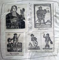
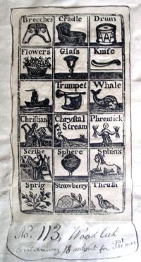
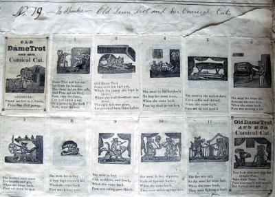
The most charming aspect of this collection are the hundreds of specimen woodcuts, many on tinted paper, mostly for scrap books, advertisements, almanacs and other ephemeral publications. Several miniature scrap books are preserved in their entirety and mounted, such as Mother Hubbard and Her Dog, Tom, the Piper’s Son, Little Red Riding Hood, The Life of Jack Sprat, His Wife and his Cat, The Cries of London, Old Dame Trot, The House that Jack Built, and Jack & Jill, and Old Dame Gill. Other miniature books are the delightful alphabet book The History of an Apple Pie or A New Riddle Book, for Little Boys and Girls, which assembles woodcuts and engravings from diverse sources, periods and styles. All miniature books were reasonably priced at halfpenny and consist of 12 pages including self-wrappers, measuring 76 x 44 mm.”
Is photography over? This is the question posed by a sold-out symposium at SFMoMA later in the month. http://www.sfmoma.org/pages/
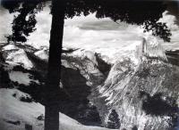
researchprojectsphotography_over. Those who could not get tickets are voicing their opinions online, filling the listservs and blogs. It reminded me of Ansel Adams (1902-1984) and his first portfolio: Parmelian Prints of the High Sierras (San Francisco: J.C. Moore, 1927).
When Adams met arts patron Albert Bender (1866-1941) and accepted Bender’s help to publish a portfolio of photographs, he also accepted the suggestion to call them “parmelian prints” (a made-up word). Bender felt the label of “photographic prints” would not allow them to be taken seriously as fine art.
Bender immediately committed the money to purchase ten portfolios (priced at fifty dollars each). Then, he got on the phone and sold fifty-six others before lunch. Adams had not even begun working on the prints. Ultimately, Adams produced a set of eighteen photographs: gelatin silver prints printed on Kodak Vitava Athena Grade T Parchment. No matter what they were called, the prints were a spectacular success.
The colophon and folders for the portfolio were printed at Grabhorn Press, in Oakland, California. Princeton University’s copy was donated by Isabel Shaw Slocum as part of the Myles Standish Slocume, Class of 1909, Grabhorn Press Collection. It is personally inscribed to Mr. and Mrs. Slocum from Adams. (WA) Oversize F868.S5 A42q.
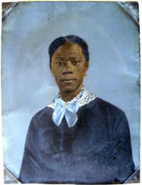
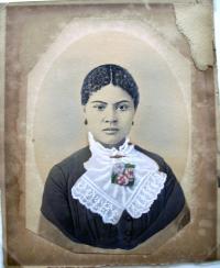
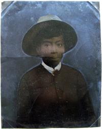
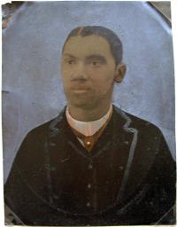
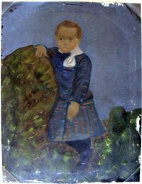
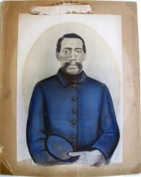
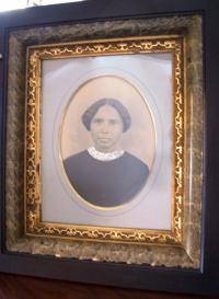
One hope in posting this new collection of, primarily, hand-painted tintype portraits of African American men, women, and children is to have as many people as possible view the images, leading to someone recognizing and identifying the sitters. Could you help us by sharing this with others? To enlarge the image, just click on it.
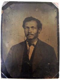
Unknown sitter, ca. 1880, full-plate tintype
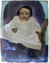
Unknown sitter, ca. 1880, hand-colored full-plate tintype
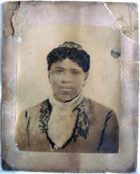
Unknown sitter, ca. 1870, hand-colored albumen silver print
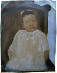
Unknown sitter, ca. 1880, hand-colored full-plate tintype
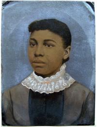
Unknown sitter, ca. 1880, hand-colored full-plate tintype
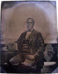
Unknown sitter, ca. 1880, full-plate tintype
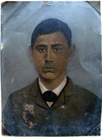
Unknown sitter, ca. 1880, hand-colored full-plate tintype
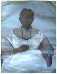
Unknown sitter, ca. 1880, hand-colored full-plate tintype

Unknown sitter, ca. 1880, hand-colored full-plate tintype
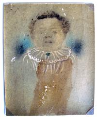
Portrait of Sally Rice, Bourbon, Georgia, ca. 1860s, hand-colored albumen silver print
Purchased with funds from the Graphic Arts Collection, African American Studies, and Women’s Studies.
A good source of information is Stanley B. Burns, Forgotten marriage, the painted tintype & the decorative frame, 1860-1910: a lost chapter in American portraiture (New York: Burns Press, Burns Collection, 1995). Marquand Library (SAPH): Photography, Oversize TR680 .B871 1995q. See their website: http://www.cmp.ucr.edu/exhibitions/forgotten_marriage/
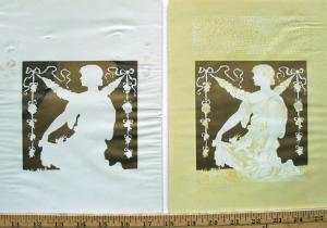
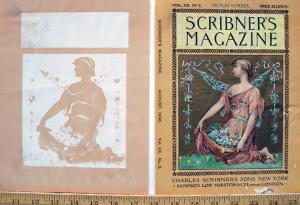
First stone
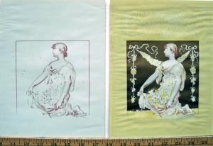
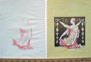
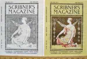
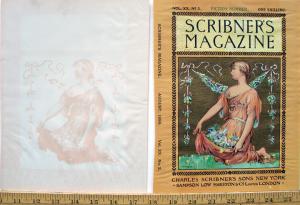
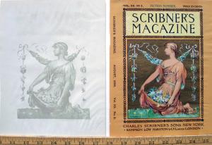
Scribner’s Magazine, launched in 1887, is credited with being the first magazine to include color illustrations. Here is a progressive set of proofs for the color cover.
Second stone
Third stone
Fourth stone
Fifth stone
Sixth stone
Seventh stone
Eighth stone
Ninth stone
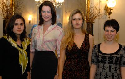
From left to right: Lauren VanZandt-Escobar, Emily Dunlay, Maria Shpolberg, and Ruthie Nachmany
The winners of the 2010 Elmer Adler Undergraduate Book Collecting Prize were announced at the Friends of the Princeton University Library’s winter dinner on March 28, 2010. The $2,000 first prize went to Emily Dunlay, class of 2011, for her essay, “The Real Belles-Lettres: On Collecting Beautiful Books.” In it, she poses the question, “Can our great works of fiction lead a dual life as both literary and visual art?” and goes on to answer, “I certainly believe so—I have spent the past five years in pursuit of beautifully and meaningfully designed editions of the classics of English literature.”
This year, the $1,500 second place prize was a tie. Lauren VanZandt-Escobar, class of 2012, was awarded the honor for her essay “The Lives, Letters, and Diaries of Great Female Artists.” She wrote, “As an artist myself, it is a privilege to have access to the writings of these artists … . Reading facsimiles of their diaries and letters, and their biographies … provides a unique perspective on the creative process behind the works produced. I collect these books because they are a means of interacting with these people whose ambitions I share, and from each one I learn something valuable.”
Maria Shpolberg, class of 2010, was also given a second place award for her essay, “In Favor of Interpretation: The Marriage of Theory and Fiction or, From Formalism to Form.” Shpolberg’s essay is a response to Susan Sontag’s 1966 ground-breaking work “Against Interpretation” and she notes that when she first read Sontag’s declaration, “In place of a hermeneutics we need an erotics of art,” she felt her hands quiver. This encounter with one author’s work led her to collect other authors’ critical writings and fiction focusing on “influences and consequences, responses and rejections.”
The judges awarded an honorable mention and a check for $500 to Ruthie Nachmany, class of 2012, for the essay, “Next Year in Jerusalem: Imaginations and Images of Israel.” Nachmany collects visual works depicting Israel, “through which we can shed light upon our culture’s fixation with ‘the promised land’.”
Each of the winners also received a certificate from the Dean of the College and a new book, chosen to complement her collection, from Princeton University Press. Our thanks to Peter J. Dougherty, director of the Press for his continuing support of this competition. Dunlay’s first prize essay will represent Princeton University in the National Collegiate Book Collecting Competition, which is now sponsored by the Antiquarian Booksellers’ Association of America.
My sincere thanks to this year’s judges: Fernando Acosta-Rodriguez, Librarian for Latin American Studies; Volker Schroder, Associate Professor of French and Italian; Laura M. Giles, Curator, Prints and Drawings, Princeton University Art Museum; and Dallas Piotrowski, Independent artist and Friend of the Princeton University Library. They faced a particularly difficult selection this year, given the wide variety of topics and high scholarship of the papers submitted. Congratulations to all our winners.
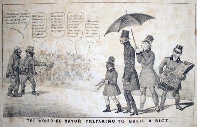
Henry R. Robinson (active 1833-1851), The Would-Be Mayor Preparing to Quell a Riot, [1837]. Lithograph. Graphic Arts GA 2010. -in process
New York City mayoral candidate John Jordan Morgan (1770-1849) is seen on the right with members of his Tammany Democratic party shortly before the municipal election April 1837. He is approached from the left by two members of the Loco Foco (the Equal Rights party), a subdivision of the Democrats. A riot occurs in the left background between Irishmen and Germans.
The dialogue reads, “Is that our candidate Bob? introduce me; the party are strangers to him.” Others say, “Well, poor Tammany is done over when such a skeleton is to represent the great democracy!” and “Do’nt whistle in the face of the new Mayor, he may catch the grippe!” and “Vel vot of it, who cares for Mr. Morgan, a good puff will blow him away …”
Morgan, a member of the 23rd Congress under Andrew Jackson, lost the New York election prompting a second print from Robinson. Entitled The Death of Old Tammany and His Wife Loco Foco, the second print satirized the heavy losses suffered by both the Loco Foco and Tammany party. An American Indian represents Tammany, his breast pierced by an arrow, and his wife, the Loco Foco, is shown as a crude Irish woman. Both are crushed under the ballot box.
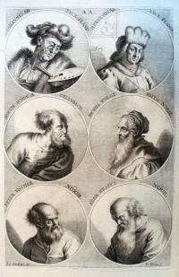
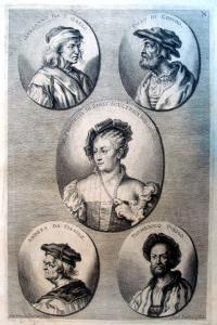
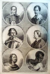
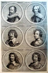
Recently, we found an unbound group of etchings by Joachim von Sandrart. We now know they are plates from Christianus Rhodius (fl. 1680), Joachimi de Sandrart … Academia nobilissimæ artis pictoriæ. Sive Dē veris & genuinis hujusdem proprietatibus, theorematibus, secretis atque requisitis aliis … instructio fundamentalis (Noribergæ: Literis Christiani Sigismundi Frobergii, 1683).
The artist and art historian Joachim von Sandrart (1606-1688) trained under Sebastian Stoskopff in Frankfurt, learned printmaking under Aegidius Sadeler in Prague, and worked in Gerrit van Honthorst’s studio in Utrecht. Initially, Sandrart planned to be an engraver but found success as a painter. During his career, he associated with Claude Lorrain and Nicolas Poussin; did drawings with Andrea Sacchi and Pietro Testa; and in 1653, was ennobled and made a member of the Palatinate-Neuburg Council.
From the mid 1660s, Sandrart was increasingly devoted to academia. He helped to establish the academy of art in Nuremberg (1662) and in Augsburg (1670). Sandrart became director of the Nuremberg academy.
In 1668, Sandrart began to write the Teutsche Academie der edlen Bau- Bild- und Mahlerey Künste, the first encyclopedic art history in German, with editorial help from the poet Sigmund von Birken. The work, published in three volumes between 1675 and 1680, was dedicated to the artists and art collectors of his day. The first two volumes include essays on architecture and sculpture, the theory of painting, biographies of ancient and modern artists, and descriptions of various art collections. Volume three added a translation of Ovid’s Metamorphoses and Cartari’s mythographic handbook. For a more complete description and searchable full-text, see http://www.sandrart.net/
In 1683, Christianus Rhodius translated part of Teutsche Academie and publish it along with a group of plates. This is the group now in graphic arts: approximately 66 etching with engraving, designed by Sandrart and printed by Philipp Kilian (1628-1693) and others.
Marquand Library has a first edition: L’Academia todesca della architectura, scultura & pittura: oder Teutsche Academie der edlen Bau- Bild- und Mahlerey Künste… (Nürnberg: J. von Sandrart; Frankfurt: M. Meriam, 1675-79). SAX Rare Books Oversize N7420 .S2f
Note, center left, Sandrart includes the image of an African European artist called Higiemonde. No biography is given.
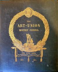
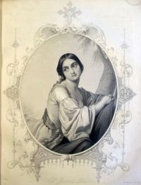
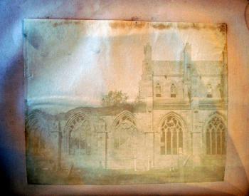
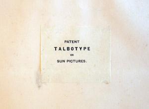
William Henry Fox Talbot (1800-1877) began production of his first photographically illustrated book, The Pencil of Nature, in 1844. The following year Talbot made a deal with Samuel Carter Hall (1800-1889), the editor of the Art Union Monthly Journal, to include one of his paper photographs in every copy of volume 8 (1846). The Art-Union was particularly known for its illustrations (including lithography, etching, engraving, and wood engraving) and Talbot was anxious for paper photography to be seen as equal to these graphic mediums.
To make the approximately 6,000 calotypes for the Art-Union edition, Talbot’s printer, Nicolaas Henneman, used every negative he could find in the shop. More than half of the twenty-four images that are published in Pencil of Nature also turn up in copies of the Art-Union. Unfortunately, Henneman’s print shop was not yet capable of such mass production and poor workmanship resulted. The paper was not properly exposed, not well fixed or washed, and badly pasted onto the magazine leaves. The images faded almost as soon as they were created and the publicity Talbot received was all negative (the image here was Photoshopped so it could be seen). Pencil of Nature ceased production that same year after only six fascicles.
Marquand Library has a complete set of Art-Union, but the talbotype was cut out and taken to the Princeton University Art Museum many years ago (a common practice). We have recently acquired another copy of the 1846 Art-Union with a photograph intact, offering the print as it was originally meant to be seen.
For more, see the wonderful Glasgow Library page: http://special.lib.gla.ac.uk/exhibns/month/Feb2007.html
Graphic Arts GA 2010.01186
In 2000, Oliver Langenberg, Class of 1935, donated nine Soviet propaganda posters from the 1930s to our collection. These huge, exceedingly rare posters document the national effort to inspire the population to embrace the collective spirit of the Communist regime in all aspects of industrial, agrarian, social, and political reform. The paper is very fragile but the condition remains very good. Here are a few examples. The description is quoted from the labels on the verso of each poster.
Graphic Arts GA2010.01185
Top left: “The Leninist young Communist league was and is the young reserve of the revolution” (Josef Stalin). Stalin is shown surrounded by a cross-section of Soviet youth with the profile of Lenin silhouetted above them. He is shown with a group of young people, one in naval uniform. Predominant colors are browns with a red flag showing the outline of Lenin and red lettering. Size: 24 1/2 x 27 3/8 inches.
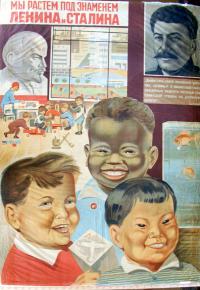
Top right: “We are growing under the banner of Lenin and Stalin. Our park is to educate a new generation of workers that should be healthy and joyful and that could be able to raise the mightiness of the great country.” Soviet leaders understood the importance of early childhood education to perpetuate the goals of revolutionary Communism and Socialism. Here children of various ethnic births are shown in a day care center at their parents’ factory. The children are portrayed with portraits of Stalin and Lenin in the background. Color printing with red lettering. Size: 30 1/2 x 42 inches.
Bottom center: “In the tremendous growth of the national culture on a Socialist basis will find its expression in the victorious growth of Socialism in the USSR” (Molotov, chairman of the Peoples Commissariat). Early Communist history is summarized showing Karl Marx, the author of Das Capital (the most important Communist book), with Vladimir Lenin who led the revolution in 1917. Behind him is the storming of the Imperial Palace. The modern industrial state “CCCP” is shown rising around the image of Josef Stalin, who led the country in 1934.
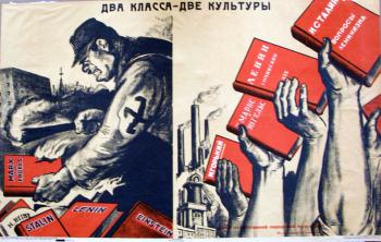
“There are two classes, two cultures.” One half of the poster shows a soldier wearing a Nazi swastika armband burning books by Communist authors (church in background). The other half shows triumphant workers holding up books by Communist authors. Size: 36 x 23 1/2 inches.

















Recent Comments