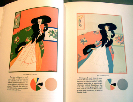
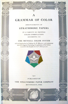
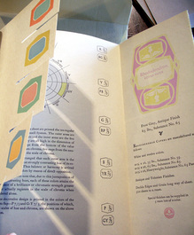
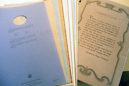
Following World War I, Thomas Cleland wrote a practical manual of color, funded and published by the Strathmore Paper Company. He outlines the almost endless options, good and bad, of printing various colored inks onto colored papers. Readers are encouraged to experiment with using various samples included at the back of the volume. Cleland went on to practice his own lessons, as art director of Fortune Magazine.
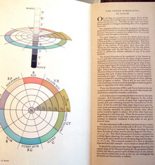
In his introduction, color theorist A.H. Munsell writes, “With white at the North pole and black at the South pole; and its axis between these points a measured scale of grays, we have a decimal neutral scale which painters call Value. The middle point of this axis must be a middle gray, and a plane passing through to the equator must contain colors of middle value. If, therefore, the equator be spread with a color circle … we have the equator as a decimal scale of hues merging gradually from one to the next and returning upon itself….”
“Each of these hues is supposed to grow lighter until it merges into the North pole at white, and darker similarly to black, and these are called the values (light) of color. They may also be imagined as passing inward until they disappear in the gray axis. Should there be still stronger colors, they will continue upon the same radii outside the sphere. These we call the chromas (strength) of color.”
