September 2009 Archives

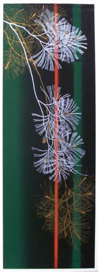
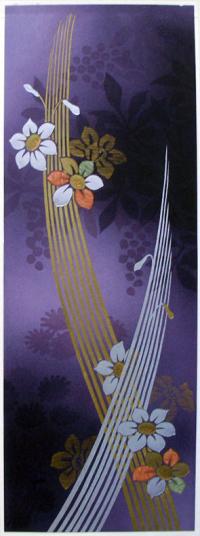
Japanese pochoir design

| 1 Comment

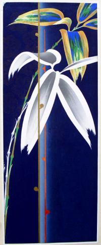
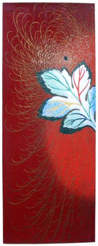
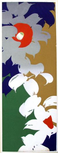
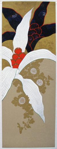
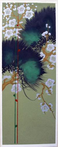
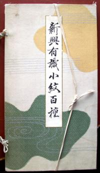
With many thanks to our Japanese bibliographer, Yasuko Makino, the literal translation of the title of this album is: New 100 Komon Designs Used in Kimono/Costumes Used in Ancient Court Ceremonies. Compiled by Sumiharu Suzuki (Kyoto: Maria Shobo, Showa 11 [1936]).

Komon literally means a small design scattered all over a kimono. http://umechiyo.ikiten.com/umechiyo-ZD-E287-14-sctg037.html Yasuko has also sent this URL to show a modern album. Below are a few more designs, printed by stencil and brush, (or to use the French term: pochoir).

Injured Humanity

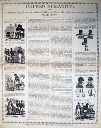
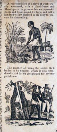
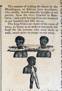
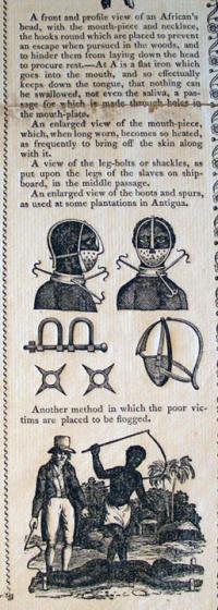
Alexander Anderson (1775-1870), Injured Humanity: Being a Representation of What the Unhappy Children of Africa Endure from Those Who Call Themselves Christians. [New York]: Printed and sold by Samuel Wood, No. 362, Pearl-street, no date [1805-1808]. Gift of Sinclair Hamilton. Graphic Arts, Hamilton 252.

In 1807, the British Parliament banned the Atlantic slave trade and the United States followed with their own mandate in 1808. This broadside was published around 1805 to incite Americans against slavery and the “horrors of the middle passage” by describing in gruesome detail the conditions that slaves had to endure. It was published by the New York printer and Quaker, Samuel Wood, who had the wood engravings prepared by the best artisan of the period, Alexander Anderson.

The broadside is undated but Wood is listed at this address in New York City directories from 1805 to 1808. The text and illustrations published here also appear in the following work, first issued by Wood in 1807: The Mirror of Misery, or, Tyranny Exposed.

A complete transcription of the broadside can be found at http://www.gilderlehrman.org/search/collection_pdfs/05/11/3/05113.pdf. I have enlarged the images and text printed along the margins to make them readable.


The Modern City

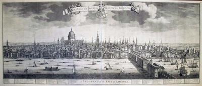
Three views of London, pulled for Professor Yair Mintzker’s Junior Seminar ‘The Modern City’.

Joseph Smith (active 18th century), A Prospect of the City of London (La Ville de Londres), ca. 1724. Engraving.

In 1707, Johannes Kip (1653-1722) engraved a series of panoramic views after drawing by Leonard Knyff (1650-1721), which he published under the title Britannia Illustrata, or, Views of Several of the Queen’s Palaces (Marquand Library SAX Oversize NA961 .B74F). The series was later expanded and published as Nouveau théâtre de la Grand Bretagne (1724), with additional prints, such as this one by Joseph Smith. The panorama stretches from Temple (no.43) on the left to the Tower of London (no.64) on the right.

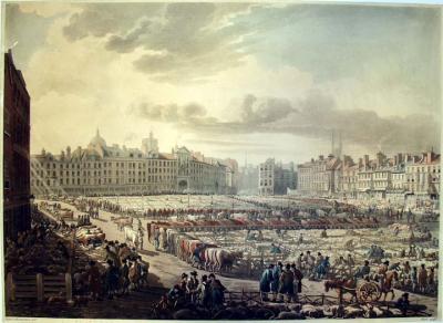
John Bluck (active 1791-1819), after a drawing by Thomas Rowlandson (1756-1827) and Agustus Pugin (1762-1832), A Bird’s Eye View of Smithfield Market Taken from the Bear and Ragged Staff, 1812. Hand colored aquatint.

From 1808 to 1811, Thomas Rowlandson worked with the architectural artist Agustus Pugin to create the 104 watercolors, aquatinted by John Bluck, for Rudolph Ackermann’s The Microcosm of London. Their second project for Ackermann was Views of London, with eighteen aquatints, which kept them busy for the next eleven years. This print is the second plate from Views of London, showing the cattle and sheep markets at the east side of the market.

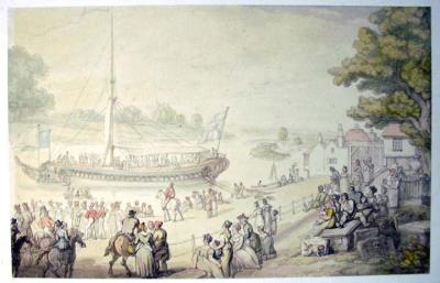
Thomas Rowlandson (1756-1827), State Barge, City of London, 1810. Pencil, pen and ink drawing.

While working for Ackermann, Rowlandson continued to pursue individual commissions. This original drawing seems never to have been converted to a print but may have been a preliminary sketch for his Views of London.

Edward Orme's Transparent Prints

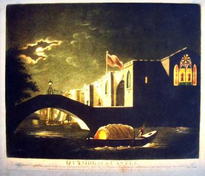
Jas. Hook, Outside of a Castle. To Lady Charlotte Campbell, this print from the original Transparent Drawing, 1798. Sold and published by Edwd. Orme, Conduit Street, London. Transparency etching.

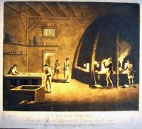
Although the British engraver and publisher Edward Orme (1774-ca. 1838) always claimed to have invented transparent prints, Michael Twyman reminds us that Rudolph Ackermann (1764-1834) published 109 transparent etchings between 1796 and 1802, along with a book entitled Instructions for Painting Transparencies (1799). Even before Ackermann, the caricaturist Mary Darly published a few “humorous and transparent prints” in 1763.

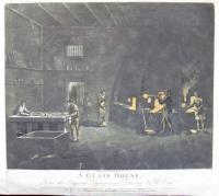
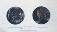
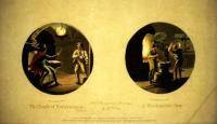
However, it was Orme who made the genre popular in the early nineteenth century through his bilingual manual, An Essay on Transparent Prints and on Transparencies in General (1807) Graphic Arts Collection (GA) Oversize Rowlandson 8415q. The effect was created by taking a normal etching or engraving, painting large areas of color on back of the print and then, adding varnish to specific areas make the paper translucent when held up to a light. Scenes often included fire light, moon light, and other glowing illusions. Orme’s instructions suggest that transparent prints could be substituted for stained glass, in lanterns, lampshades, and fire screens.

W. Orme, A Glass House. From the Original Transparent Drawing, 1799. Sold & Published by Edwd. Orme, Conduit Street, London. Transparent etching.

The Tomb of Rosicrucious. A Blacksmith’s Shop, 1799. Sold & Published by Edwd. Orme, Conduit Street, London. Transparent etching.

Congratulations Tim Barrett

Congratulations to Timothy Barrett, master papermaker and paper historian, who is one of twenty-four recipients of the five-hundred-thousand-dollar “genius awards,” announced this morning by the John D. and Catherine T. MacArthur Foundation. See more: http://www.uiowa.edu/~ctrbook/people/staff/Barrett/Barrett.shtml and the papermaking studio: http://www.uiowa.edu/~ctrbook/facilities/paper/index.shtml

Timothy Barrett, Nagashizuki: the Japanese craft of hand papermaking (North Hills, Pa.: Bird & Bull Press, 1979) Graphic Arts Collection (GAX), TS1109 .B267

Trvth Brought to Light and Discouered by Time

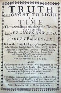
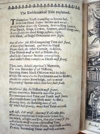
We don’t actively collect pages torn out of books but we have them. Some are easier to trace than others. This half-title page from a folder labeled seventeenth century leaves was designed and engraved by Flemish artist John Droeshout (1596-ca. 1652) while working in London. It was printed by Richard Cotes and sold by Michaell Sparke in 1651 to accompany a volume concerning the poisoning of Sir Thomas Overbury (1581-1613) and its aftermath.

When you go to the actual book, entitled The Narrative History of King James, for the First Fourteen Years (Ex 14431.669) you will not only find the engraving happily bound in it place but the “Emblematical Title explained” next to it. This text explains the print’s iconography beginning in the top left where a naked female figure of Truth tramples on Error. On the right the male figure of Time stands on the skeletal body of Death. Together they pull back a curtain to reveal the sleeping King James I. At the bottom left is Memory with his feet holding down black Oblivion. On the lower right is History, writing down what Memory tells him, with Sloth under his feet. Between them is a coffin, out of which grows a tree sprouting books and lights to make “succeeding Times most rich and rare.”

Embossed binding and light verse

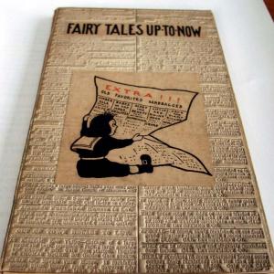
Wallace Irwin (1876-1959), Extra!! Fairy Tales Up-To-Now. Wallace Irwin, the Bandit, Again Breaks Loose and Sandbags Old Favorites…. (San Francisco. Paul Elder, 1904). Graphic Arts (GAX) 2009- in process

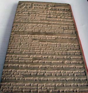
Irwin was an American journalist working for William Randolph Hearst’s Examiner, before he found his voice in light verse. This volume includes tabloid style parodies of Babes in the Wood, Cinderella, Jack the Giant-Killer, Sleeping Beauty and Little Red Riding Hood. Boards are paper pulp embossed by a metal stereotype plate set for a newspaper page.

Irwin also published The Love Sonnets of a Hoodlum (1901) EX 2004-0767N; The Rubaiyat of Omar Khayyam, Jr. (1902) Annex A 3798.01.379; The Shame of the Colleges (1907) EX 3798.01.385; and Suffering Husbands (1920) Annex A 3798.01.389

Little Red Riding Hood begins

Adulterated Food!
W. Gray Wolf Dies Under Suspicious Circumstances And Little Red Riding Hood Indicted

The two seen together shortly before the tragedy occurred

The parents of Red Riding Hood
Were sharks for scientific food,
And members of a hygiene club
That lived on predigested grub.

When Mrs. Hood was touched with grace
She thought of heaven, as a place
Where all is anticepticized
And even the harps are sterilized.

It chanced one day that Gradma Hood,
Who lived alone within a wood,
Of Bunco Biscuits ate her fill
And fell quite seriously ill.

…Paul Chowder eat your heart out.

De anima brutorum commentaria (Commentary on the soul of animals)

| 3 Comments


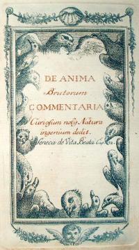
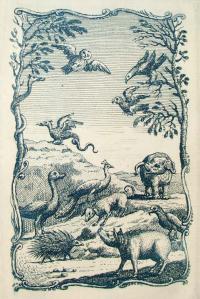
Francesco Maria Soldini, De anima brutorum commentaria: curiosum nobis natura ingenium dedit (Commentary on the soul of animals: nature gave us an inquiring mind) (Florence: Cajetan Cambiagus, 1776). Frontispiece and seven additional engravings, along with engraved initials, borders, and headpieces. Artist unidentified. Graphic Arts (GAX) 2007-2116N

An odd combination of animals, real and imagined, are depicted in these lovely engraved plates, printed in various colored inks and interspersed throughout Soldini’s text. The title page is printed À la poupée, which means the plate was carefully hand inked in several colors printed altogether (instead of individual plates for each color printed separately). The process is named after the wad of cloth that was used in the inking, which looked like the head of a rag doll (poupée)

The animals include a rhinoceros, a camel, various amphibians, and even prehistoric beings. It is curious to see them all crawling or walking or flying together. I see from other copies that the plates are not always bound in the same order and the frontispiece (in ours) is not always at the front. Note, the PhotoShopping of the color of these digital imagines is not very good; not particularly close to subtle original tones in our book.

The dealer Susanne Schulz-Falster points out that the book was “issued nearly a century before Darwin’s theories of evolution” and it earned a place on the Index Librorum Prohibitarum. This was the list of publications prohibited by the Roman Catholic Church, happily abolished in 1966 by Pope Paul VI. Princeton’s earliest copy of the Index dates from 1611.
Indices expvrgatorii dvo, testes fravdvm ac falsatonium pontificiarum (Hanoviæ, apud G. Antonium, anno 1611). Rare Books (Ex) 0408.49.121

Mark Farrell, our brilliant rare book cataloguer, adds these notes about the title and its translation: Julie, the title proper and subtitle are divided wrong. Commentaria belongs to the title proper, not to the subtitle. Also, there is no such word as nobii in Latin. The title should be transcribed thus:
De anima brutorum commentaria: curiosum nobis natura ingenium dedit: Seneca de vita beata cap. 32.
and translated thus:
Commentary on the soul of animals: nature gave us an inquiring mind: Seneca De vita beata, ch. 32 [i.e. Seneca De otio, ch. 5].

The subtitle is actually an epigraph, and it is taken from chapter 5 of Seneca’s De otio (On leisure), not, as the title page says, from chapter 32 of his De vita beata, which, by the way, has only 28 chapters. Here is a translation by Aubrey Stewart of the whole sentence:

Nature has bestowed upon us an inquiring disposition, and being well aware of her own skill and beauty, has produced us to be spectators of her vast works, because she would lose all the fruits of her labour if she were to exhibit such vast and noble works of such complex construction, so bright and beautiful in so many ways, to solitude alone.

Czech book design

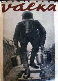
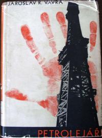
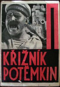
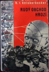
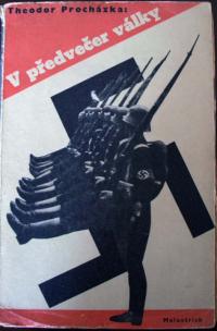
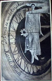
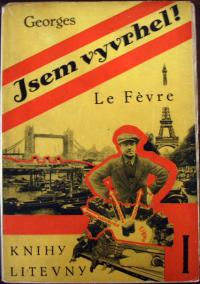
Critic and designer Karel Teige said that the cover of a book must be like a poster advertisement. His work was part of the golden age of avant-garde Czech book design, begun in 1920 with the poets and artists of the Devetsil Artistic Union (DAU). Their designs appeared on trade books from many publishing houses and influenced a generation of graphic artists. Here are a few examples. For more, see the Cooper Hewitt’s exhibition website: http://www.sil.si.edu/ondisplay/czechbooks/intro.htm

Ludwig Renn (born Arnold Friedrich Vieth von Golsseneau, 1889-1979), Valka (Prague: Vaclav Petra, 1930). Wrapper design by Josef Kaplický (1899-1962). Graphic Arts (GAX) 2009- in process

Jaroslav R. Vávra (1902-1990), Petrolejáři (Oil): román z anglo-americké petrolejové války 1927 (Prague: Druzstevní práce, 1937). Wrapper design by John Heartfield (1891-1968). Graphic Arts (GAX) 2009- in process


F. Slang (pseud. for Fritz Hampel), Kriznik Potemkin. Povstani Namorniku Pred Odescu 1905 (Prague: Jan Fromek, 1926). Wrapper design by Karel Teige (1900-1951). Graphic Arts (GAX) 2009- in process

Milor Vitek, Mauthausen 1942 Dachau 1945 (Brno: Klub Kounicových Koleji, 1946). Cover design by Zdeněk Rossmann (1905-1984). Graphic Arts (GAX) 2009- in process


Hubert Renfro Knickerbocker (1898-1949), Rudy Obchod Hrozi (The Red Trade Menace)(Prague: Nakladem Ĉeska Graficke Unie, 1932). Wrapper design by Josef Hesoun. Graphic Arts (GAX) 2009- in process

Theodor Prochazka, V Předvečer Války (Prague: Melantrich, 1945). Cover design by Karel Teige (1900-1951). Graphic Arts (GAX) 2009- in process


Karel Schulz (1899-1943), Dama U Vodotrysku (Prague: Ladislav Kuncir, 1926). Wrapper design by the partnership of Jindrich Styrsky (1899-1942) and Toyen (born Marie Cerminova, 1902-1980). Graphic Arts (GAX) 2009- in process

Georges Le Fèvre, Jsem vyvrhel! (Prague: Knihy Litevny, 1931). Cover design by L. Hradsky. Graphic Arts (GAX) 2009- in process

Frank Vincent DuMond

Frank Vincent DuMond (1865-1951), The Noise of the Falls Makes Music, ca. 1900. Oil on board. Graphic Arts (GA) 2009- in process

When F.V. DuMond moved to New York City in 1884, he quickly found work as an illustrator at the New York Daily Graphic. Although DuMond went on to publish in Harper’s Weekly, Century and McClure’s magazines, it was not the career he wanted and so, left for Paris and the Académie Julian.

When DuMond returned to New York, he accepted a teaching position at the Art Students League and presided over ASL classes for the next fifty years. His students included a who’s who of modern American artists, including John Marin, Georgia O’Keeffe, and Norman Rockwell.

This undated oil painting comes from DuMond’s early career when he was under the influence of the late-nineteenth-century symbolists. An angler is caught in a trance, brought on by the music of three sirens, who appear from inside a nearby waterfall. The painting comes to Princeton thanks to the Otto von Kienbusch, class of 1906, who liked anything to do with angling.

For more information, see The Harmony of Nature: the Art and Life of Frank Vincent DuMond (Old Lyme, Conn.: Florence Riswold Museum, 1990). Marquand Library SA ND237.D846 F58

Henry Irving's "Macbeth" 1888


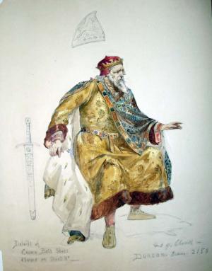
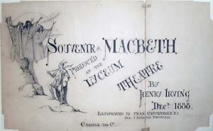
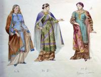
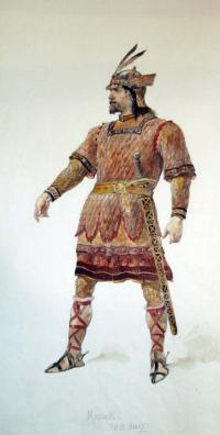
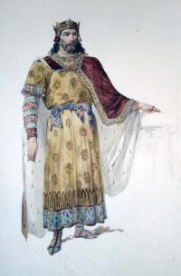
Charles Cattermole (1832-1900), Costume designs for Macbeth, 1888. Watercolors. Theater Collection (TC) in process


When Sir Henry Irving (1838-1905) first played the title role in Shakespeare’s Macbeth in 1875, The Times noted that it was to Irving’s advantage that he was “appearing at a time when there is no important rival to suggest comparisons.” The unnamed reviewer goes on to characterize the performance as “a conception of the actor’s own fancy, which can be supported only by a corruption and misinterpretation of the plain meaning of the dramatist. From first to last Irving’s Macbeth is a poor, frightened, whimpering cur, without even a passing touch of any kind of manliness, except, perhaps, one flash in his last moments.” The production closed in less than three months.

In 1878, Irving purchased the Lyceum Theatre and in 1888, along with his lover Ellen Terry (1847-1928), revived his Macbeth in a freshly designed and directed production, with music by Arthur Sullivan. They played to standing room crowds for over six months. Costumes and props were designed by Charles Cattermole (not to be mistaken for George Cattermole, 1800-1868, who illustrated books by Charles Dickens and Sir Walter Scott).

Cattermole worked several times for Irving, creating everyone’s costumes except Terry’s, who used her own designer/advisor Alice Comyns-Carr along with the dressmaker Mrs. Nettleship. Unfortunately for Cattermole, when John Singer Sargent (1856-1925) chose to immortalize Terry in her Lady Macbeth costume, the other designs by Cattermole were all but forgotten.

Monografieën over Filmkunst, designed by Piet Zwart

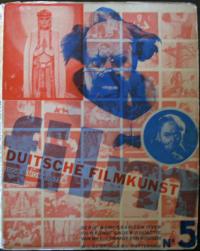
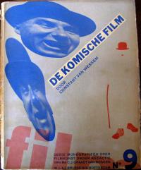
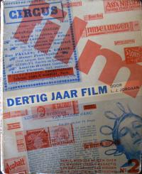
Monografieën over Filmkunst (Monographs on Art Films), edited by C.J. Graadt van Roggen (Rotterdam: W. & J. Brusse’s Uitgeversmaatschappij, 1931-1933). 10 vols. All in the original wrappers, designed by Piet Zwart (1885-1977). Graphic Arts (GAX) in process
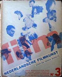
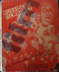
This set of monographs on early twentieth-century film is as important for the graphic design of the covers, as it is for the discourses on cinema inside. The individual volumes are:
1) C.J. Graadt van Roggen, Het Linnen Venster (The Linen Window), 1931.
2) J.L.J. Jordaan, Dertig Jaar Film (Thirty Years Film), 1932.
3) Henrik Scholte, Nederlandsche Filmkunst (Dutch Cinema), 1933.
4) Th.B.F. Hoyer, Russische Filmkunst (Russian Cinema), 1932.
5) Simon Koster, Duitse Filmkunst (Coastal German Cinema), 1931.
6) Elisabeth de Roose, Fransche Filmkunst (French Cinema), 1931.
7) J.F. Otten, Amerikaansche Filmkunst (American Cinema), 1931.
8) Menno ter Braak, De Absolute Film (The Absolute Film), 1931.
9) Constant van Wessem, De Komische Film (The Comedy Film), 1931.
10) Lou Lichtveld, De Geluidsfilm (The Sound Film), 1933.

Each volume has a unique design created by the Dutch artist Piet Zwart, who had multiple careers as an interior designer, industrial design, commercial typographer, photographer, critic and lecturer. At the close of the twentieth century, Zwart was named ‘Designer of the Century’ by the Association of Dutch Designers.

He preferred the title of form technician to graphic designer. His innovative typography and jacket covers steal from De Stijl in his limited palette and geometric layout, without being weighed down by its rules. He flirted with Russian Constructivism and was one of the first designers to consider issues of ergonomics into his industrial projects. Structure, balance, and repetition are constants in his work, which often incorporated photographic images he shot himself. When this film series was complete, Zwart abandoned typographic projects to concentrate on industrial and furniture design.

For more information on Zwart, see: Arthur Allen Cohen, Piet Zwart, Typotekt (New York: Exlibris, [1980]). Marquand Library (SAPH): N6953.Z85 C654 1980

For informaton on Princeton University’s Film & Video Program, see: http://www.princeton.edu/arts/artsatprinceton/film/abouttheprogram/
Werner Pfeiffer


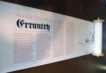
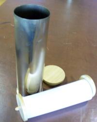
Werner Pfeiffer, Errantry (Red Hook, N.Y.: Pear Whistle Press, 2008). 29 x 830 cm. in box 16 x 46 x 16 cm. Copy 10 of 52. Graphic Arts (GAX) in process

The sculptor and book artist Werner Pfeiffer is currently installing an exhibition of his work down the road at the University of Pennsylvania, opening Thursday, September 17, 2009, at 5:30 p.m. http://www.library.
upenn.edu/exhibits/pfeiffer.html
. This seems like a good opportunity to mention two recent acquisitions of Mr. Pfeiffer’s work in the graphic arts collection at Princeton University.

Errantry is a scroll inspired by Der Triumphzug Kaiser Maximilians or The Triumphal Procession of the Emperor Maximilian (1515), a series of 130 woodcuts by Hans Burgkmair the Elder (1473-1531) and others. Pfeiffer has created his own militant parade of 20th-century violence and agression.

The title and text are based on a poem written by J.R.R. Tolkien in the 1930s, thought by many to be about war. The poem used in this scroll is an adaptation with only two or three lines directly quoting the original but with the syntax, rhyme, and meter of Tolkien’s writing.

The text and images are set against a chilling chronology of war, conflict, and genocide in the 20th century, printed digitally on a 27 foot long canvas. The scroll is housed in an actual 105 mm Howitzer artillery brass casting, manufactured for use in the M14 gun in 1943.

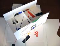
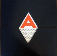
Werner Pfeiffer, Abracadabra: an homage to Hendrik Nicolaas Werkman; a set of typographic explorations (Red Hook, N.Y.: Pear Whistle Press, 2007).

Abracadabra is a book about magic,” writes Pfeiffer, “Not the illusory trickery of a conjuror, but the magic of an artist’s work.” It is an homage to Dutch graphic artist and resistance fighter Hendrik Nicolaas Werkman (1882-1945), who was executed by the Nazis in the waning days of World War II. In particular, it is a recognition of the inventive typographic works Werkman called drucksels. These unusual pieces combine letterforms with geometry and color. Pfeiffer has created a set of designs based on the letterforms of Abracadabra both in individual plates and in three flexagon structures that can be folded and flipped into multiple forms of fabulous visual geometry.

Recent Comments

  • Howard Coblentz: I have a round seal shaped like a pear a read more
  • John Overholt: Wikipedia's entry for Sir Francis says: "Throughout Baring's lifetime his read more
  • Serge Rodrigue: It is a precious thing you have a book from read more
  • Colin Wicks: I have a copy of “A Round Game.” And it read more
  • Laurence Hilonowitz: I was a Customer, Friend of Bob Wilson. I Live read more
  • allen scheuch: Absolutely STUNNING! Those colors, those designs made my day! Thanks, read more
  • Olivier: Hello Diane, If you are still looking for an examplare read more
  • Stella Jackson-Smith: I have a framed picture by A.Brouet, signed with the read more
  • John Podeschi: I remember Dale fondly from my days at Yale (1971-1980). read more
  • Joyce Barth: I have some or all of this same poem. I read more