August 2010 Archives

Fantastical Portraits of Engravers, Illustrators, & Binders

| 1 Comment

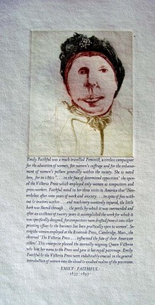
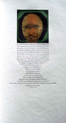
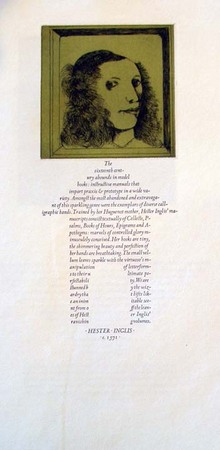
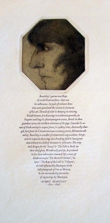
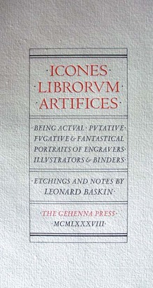
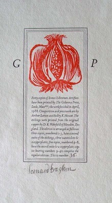
Leonard Baskin (1922-2000), Icones Librorum Artifices: Being Actual, Putative, Fugative & Fantastical Portraits of Engravers, Illustrators & Binders (Leeds, Mass.: Gehenna Press, 1988). Composition and presswork are by Arthur Larson. Copy 36 of 40. Graphic Arts Collection (GAX) Oversize Z232.G2956 B37 1988f

baskin4
baskin

Leonard Baskin established the Gehenna imprint in 1942, while he was a student at the Yale School of Art. Some people name Icones Librorum Artifices as one of the Gehenna masterpieces. The volume offers thirty-two portraits drawn by Baskin and printed by D. R. Wakefield, along with biographical text written by Baskin and imaginatively set in Arrighi and Centaur type. The subjects of the portraits are both real and imagined, well known and unheard of, including men and women from the last five centuries.

baskin2
baskin3
baskin5
baskin6

The Colophon. An adventure in enthusiasm.

colophon5
colophon14
colophon8
colophon7

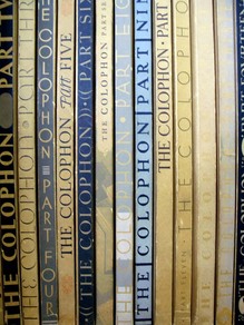
“An adventure in enthusiasm.” This is how Elmer Adler (1884-1962) described his magazine The Colophon: A Book Collectors’ Quarterly (later A Quarterly for Book Lovers). Each signature within an issue was produced by a different printer using their own choice of papers, typography, and illustration. The signatures were bound together in boards by Adler’s Pynson Printers and marketed to 2,000 subscribers.

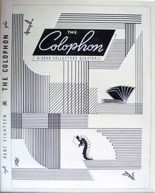
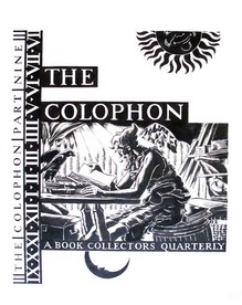
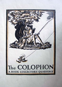
Similarly, each cover was designed by a different artist in a different style beginning with the first issue, which was designed by the Scottish American artist Edward Arthur Wilson (1886-1970), a student of Howard Pyle. Adler kept the original art, including separations and multiple drafts for each issue. When he moved to Princeton to establish the graphic arts collection for the university, the cover art came with him.

Here is a list of the cover artists through 1935:

Edward A. Wilson Part 1 1930 February
Joseph Sinel Part 2 1930 May
Gustave Jensen Part 3 1930 September
Donald McKay Part 4 1930 December
W. A. Dwiggins Part 5 1931 March
T.M Cleland Part 6 1931 June
Leroy Appleton Part 7 1931 September
Frank McIntosh Part 8 1931 December
Edward A. Wilson Part 9 1932 February
Boris Artzybasheff Part 10 1932 May
T.M. Cleland Part 11 1932 September
Ervine A. Metzl Part 12 1932 December
John Atherton Part 13 1933 February
Marie Lawson Part 14 1933 June
Jack Tinker part 15 1933 October
Louis Bouché Part 16 1934 March
Carl Noell part 17 1934 June
Farle A. Drewry Part 18 1934 September
Kirk C. Wilkinson Part 19 1934 December
Frederic W. Goudy Part 20 1935 March

Artists can be searched through the online index at http://www.artistarchive.com/List/PeriodicalList.aspx


The Colophon. New York: Pynson Printers, 1930-1940. Graphic Arts Reference Collection (GARF) Z1007 .C71; Vol. 1, pt. 1 (Feb. 1930)-v. 5, pt. 20 (March 1935); new ser., v. 1, no. 1 (July 1935)-v. 3, no. 4 (autumn 1938); new graphic ser., v. 1., no. 1 (1939)-no. 4 (Feb. 1940)

Why Does Nobody Collect Me?

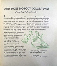
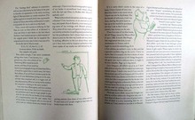
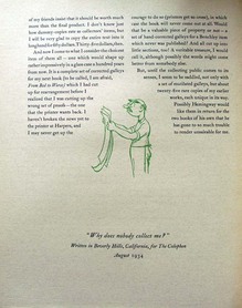
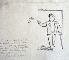
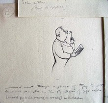
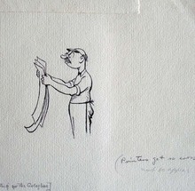
In 1934, the American humorist Robert Benchley (1889-1945) was cornered by Elmer Adler (1884-1962) to write a piece for Adler’s magazine The Colophon. This was one of twenty essays Adler commissioned by successful authors telling how they first got published. Benchley titled his “Why Does Nobody Collect Me?” and had his friend from the New Yorker, William Steig (1907-2003), illustrate it.

colophon3
colophon2
colophon


In 1937, Adler brought all the essays together in Breaking into print: being a compilation of papers wherein each of a select group of authors tells of the difficulties of authorship & how such trials are met (GA 2009-0083N). For the book, he added the answers to a series of questions about how each author wrote, how many drafts they made, and so on.

Benchley replied “Dear Adler: I hope that I am not too late to contribute the following priceless items to your Natural History of Belles Lettres: I can not write more than three or four lines of longhand without fainting. Even if I could, I wouldn’t be able to compose on anything but a typewriter, probably a bad habit from newspaper days.”

…”For Harper’s I get a set of galleys, which I am unable to read through, being so sick of the stuff already. I answer the queries, and that’s all. As a result, in my last book, there was a whole line misplaced, giving the paragraph no sense at all. I hadn’t caught it in the proof, because I hadn’t read it, and evidently the proof-reader at Harper’s didn’t notice the different.”

colophon12
colophon11
colophon10
colophon9

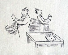
Happily, Adler saved the original art, which now resides in the graphic arts collection. William Steig (1907-2003), Untitled pen drawings for Robert Benchley’s “Why Does Nobody Collect Me?” in The Colophon, Part 18, 1934. Graphic Arts GC051 The Colophon Collection.

Soft reading, with a fringe

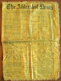
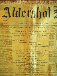
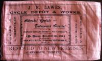
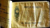
In 1897, the Aldershot Cottage Hospital (approximately thirty-five miles from London) finally opened with beds for ten patients. Every fall, the town of Aldershot had been holding a carnival or park fête to raise money in order to build a hospital. Special cloth programs and issues of the Aldershot newspaper were printed on colorful silk/satin and sold as souvenirs. Several of these from the first and second carnivals have been acquired by graphic arts. Note the advertisement on the front page for a typewriter offering visible writing.

The Aldershot News. No. 72, Saturday, November 2, 1895 (Aldershot: printed and published by the Proprietors, Gale and Polden, Ltd., Wellington Works, 1895). Printed on yellow silk. Graphic Arts (GAX) 2010- in process.

The First Aldershot Cyclists and Tradesmen’s Carnival in Aid of the Proposed Cottage Hospital for Aldershot … November 5th, 1894. Official programme. 10 leaves printed on pink silk. Graphic Arts (GAX) 2010- in process.

Official Programme of the Second Annual Hospital Carnival … Wednesday, October 30, 1895. (Aldershot: J. May, Steam Printer, 1895). 10 leaves printed on yellow silk. Graphic Arts (GAX) 2010- in process.

Georges Perec

perec
perec2
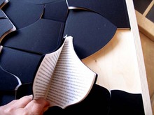
Georges Perec (1936-1982). La Vita, Istruzioni per l’Uso (Life: A User’s Manual). Milano: Rizzoli, 2009. Graphic Arts (GAX) 2010- in process.

The “BUR design” series marks the 60th anniversary of the famous pocket series published by Rizzoli. The idea was “to pick out a group of classics and then, entrust each to a well known artist, designer, or architect to be enlarged, mixed up, or submitted to physical transformation. … [creating] books which may be different and yet are still books, books which hide under a new disguise.”

The book chosen here is Georges Perec’s La Vita, Istruzioni per l’Uso (Life: a User’s Manual), which has been transformed by the Italian designer Enzo Mari (born 1932) into a jigsaw puzzle in a Plexiglas frame. The puzzle’s eighteen pieces are each small books with one chapter of Perec’s text, translated into Italian. The work is delivered along with a short volume explaining the project and a copy of the original book.

My thanks to Linda Turzynski who processed this acquisition for us.

Bubbles from the Brunnens of Nassau

| 1 Comment
bubbles3

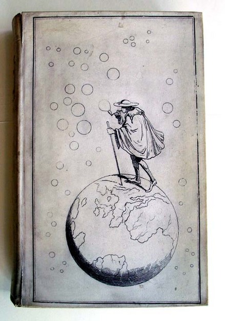
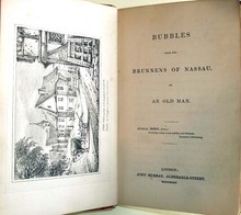
Eric Quayle writes, “By 1834 the battle was won, and it was then that the first fully cloth-bound book appeared which featured pictorial covers. This was a landmark in book design, and must have caused a considerable stir in the publishing world. The idea seems to have been the brain-child of the author, the eccentric Sir Francis Bond Head (1793-1875). Bubbles from the Brunnens of Nassau was published by John Murray in 1834 … [and] the tipped-in plates of the first edition were described as having been drawn by Burges’s patent Paneidolon.” The first edition sold out, as did the second edition published the same year. (The Collector’s Book of Books. Graphic Arts GARF Z987.Q34Q)

Ellen Morris puts it in anything way, “This period also produced the first full-cover designs: John Murray’s 1834 issue of Bubbles from the Brunnens of Nassau is reputedly the earliest publisher’s cloth binding with a full pictorial design on its cover.” (The Art of Publishers’ Bookbindings 1815-1915 Graphic Arts GA Oversize Z269.3.P8 M67 2000Q)

Princeton has acquired a first edition of Head’s Bubbles with the unusual cover design of a hiker walking across the globe while blowing bubbles stamped, front and back, not on cloth but on vellum. The paneidolon seems to have been a compromise between a camera obscura and a camera lucida, involving a box big enough for the artist’s head and arm, in which one could trace a transmitted image.

bubbles
bubbles2

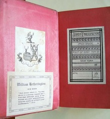
Sir Francis Bond Head (1793-1875), Bubbles from the Brunnens of Nassau. 1st ed. (London: J. Murray, 1834). Graphic Arts GAX 2010- in process.

Color Printing Samples

| 1 Comment
victorian printing album
victorian printing album2
Victorian Color Printing Album. [London, 1890s]. Graphic Arts (GAX) 2010- in process.

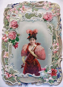
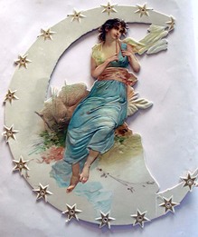
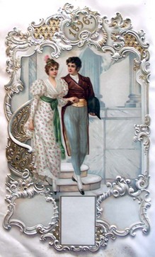
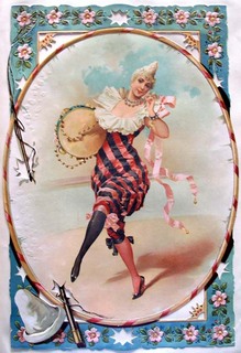
This lovely album of fancy color printing may be a sample book of M. L. Jonas Wolf & co, Ltd, of 21 Australian Avenue, London. The volume offers examples of printing on forty-five unnumbered leaves, with approximately 135 samples (both mounted and unmounted), most of them numbered in pencil on the blank leaf above the sample. A few are dated: 1896 and 1897. Some have M.L. Jonas Wolf’s stamp on the back.


victorian printing album3
victorian printing album7
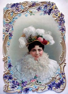
Judging by the nature of the images here, it seems that the company produced standard, pleasing images designed to be used for decorative purposes such as greetings cards, calendars, menus, advertisements and other mass-produced printed products. The pictures are largely designed to appeal to the dreams of the aspirant middle class: cherubic children and kittens, shepherdesses, lords and ladies in historical dress, soldiers and sailors, and colorful animals.
victorian printing album6
victorian printing album4

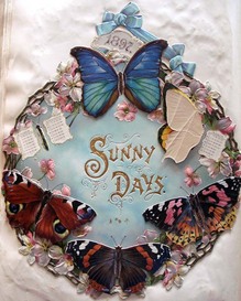
The mounted images, which vary from about 200 x 150mm to 450 x 300mm in size, are all numbered in the same hand in pencil, and it is probable that the volume was part reference and part sample book. Annotations read, for instance, “21047 grained block” or “21182 varnished block” or “21061 gelatined, incrusted, block” (the last named being partly raised and gilt, and available as an alternative 21060 without incrustation). Some of the blocks include movables or flaps. One image of a sailor has him climbing up (or down) a real rope. A calendar, pictured above, entitled Sunny Days, has the months concealed by the wings of six butterflies, whose wings can be folded back to check a date.

A New Phantasmagoria

magic lantern.jpg
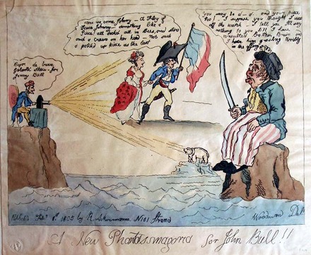
After George Moutard Woodward (1760-1809). A New Phantasmagoria for John Bull!!, 1 February 1805. Hand-colored etching. Published by Rudolph Ackermann, London. Graphic Arts British caricature

George Woodward was a caricaturist from Stanton-by-Dale, Derbyshire, whose drinking habits are perhaps better known than his art. When he moved to London his inheritance had already been spent. More often than not, he provided the drawing of an idea to publishers and to other caricaturists, rather than a completed etching. He very sadly passed away one night at his usual spot in his local tavern.

In this print, John Bull is seen as a sailor wearing striped trousers, a sword in his right hand. He looks towards two figures poised on the beams, which radiate from a magic lantern worked by Napoleon. Other beams reach a bear standing on a rocky island on the horizon behind John. Napoleon says: “Begar de brave Galanté Shew - for Jonny Bull.” The two lantern-figures include a French officer, holding a tricolour flag in the left hand, and young woman. He says: “Here we come Johnny - A Flag of Truce Johnny - something like a Piece! all deckd out in Bees, and stars and a crawn [sic] on her head - Not such a patch’d up piece as the last.” John answers with a distrustful stare: “You may be d——-d and your piece too! - I suppose you thought I was off the watch - I tell you Ill say nothing to you till I have consulted Brother Bruin and I hear him grouling teribly in the offing.” (from M. Dorothy George, Catalogue of Political and Personal Satires in the British Museum, VIII, 1947)

Vincente Huidobro

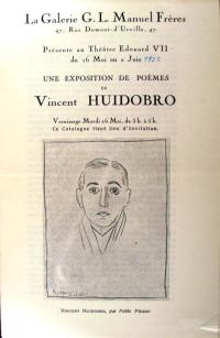
La Galerie G.L. Manuel frères, 47, rue Dumont-d’Urville, 47, présente au Théatre Edouard VII du 16 ma au 2 juin, une exposition de poèmes de Vincent Huidobro([Paris: s.n., Imp. Union), 1922. Graphic Arts (GAX) 2010- in process

In 1916, the Chilean poet Vicente Huidobro (1893-1948) founded a new artistic movement, which he called Creationism. He wrote that a poet shouldn’t just “sing to the rose but make it flower in the poem itself” (Por qué cantáis la rosa, hacedla florecer). Huidobro left Chile and settled in Paris, where he mixed with the Parisian avant-garde, including Pablo Picasso, Juan Gris, Jacques Lipchitz, Joan Miró, and Paul Eluard. In 1921, Huidobro founded the first of several arts journals, this one called Creación (self-published using a family inheritance).

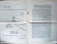
Early in 1922, an exhibition entitled Salle XI opened at Théatre Eduard VII. On the walls were thirteen visual poems by Huidobro, who referred to them as paintings. The exhibition invitation/catalogue (seen here) contains a preface by Maurice Raynal, a portrait of Huidobro by Picasso, and one of Huidobro’s letterpress calligrams titled Paysage (Landscape), dedicated to Picasso.

Folded and laid in was the poster/poem/manifesto Moulin, (first published in Creación) whose lines form the image of a windmill, designed by Robert Delaunay. The text of the poem begins at the center, moves outward with verses on each turning blade, and ends with the line at the bottom of the page concerning grey hair. Not long after this, Huidobro abandoned the idea of writing calligrams such as Paysage and Moulin, and began concentrating on the verbal sequence rather than the visual display of words.

See more: The Poet is a Little God: Creationist Verse by Vicente Huidobro (Riverside, CA: Xenos Books, 1990). Firestone Library (F) PQ8097.H8 A17 1990

One possible translation of Paysage:
In the Evening we will stroll down parallel paths
The moon in which you look at yourself
The tree was higher than the mountain
But the mountain was so wide it projected beyond the earth’s edges
The flowing river contains no fish
Do not play on the freshly painted grass
A song leads the sheep toward the stable
Charles Hobson's Trees

hobson5
hobson4
hobson2.jpg
hobson1
hobson6

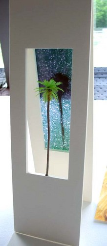
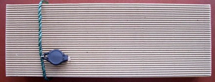
Charles Hobson, working with the W.S. Merwin, Princeton Class of 1948, poem Trees, has created a new limited edition artists’ book housed in a wooden box. He writes, “The impetus to use palm trees as a visual accompaniment to the poem came from the return address in Hawaii on the letter from W.S. Merwin giving his permission.”

The hinged pages and monotype images can be read horizontally and/or vertically, in daylight or using the tiny flashlight that comes attached to the box. When one shines the flashlight on the tree and through the opening at the back of the book, the light projects mysterious shadows of trees against the the luminous night sky.

Charles Hobson, Trees. Poem by W.S. Merwin (San Francisco: Pacific Editions, 2010). Copy 8 of 30. Graphic Arts (GAX) 2010- in process. For more information, see http://www.charleshobson.com/books/trees.html.

L'Album, not for the meek

lalbum2

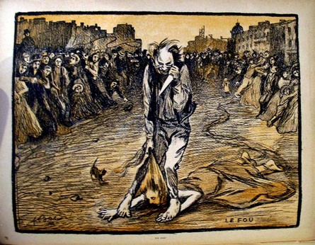
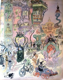
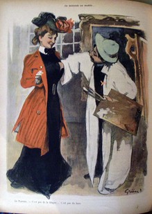
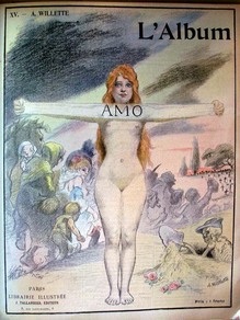
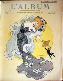
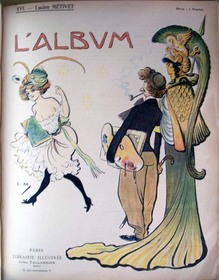
At the turn of the last century, the development of color lithography led to the emergence of many French periodicals. Gil Blas illustré, Le Rire, L’Assiette au Beurre and Le Figaro are some of the best. My favorite, L’Assiette was loosely based on the German magazine Simplicissimus and devoted each issue to a single topic.

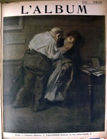
The French publishing house of Jules Taillandier decided to get into the game and issued the short-lived periodical titled simply: L’Album. Each issue was devoted to the work of an individual artist, with a centerfold section offering several double-page spreads and commentary by Lucien Puech. The imagery was uncommonly graphic and sexual in nature, possibly the reason it did not last very long. The work of painters Adolphe-Léon Willette (1857- 1926) and Jean-Louis Forain (1852-1931) was featured, along with Emmanuel Barcet, Marcel Capy, Jacques Villon, and many other.

lalbum7
lalbum6
lalbum3
lalbum4

lalbum1
lalbum5

L’Album. Paris: Montgredien et Cie., no. 1-[18]; [1 juin 1901]-[1 nov. 1902]. Graphic Arts Collection (GAX) Oversize 2005-0585

Brand Name Damages' magazine Zinemag

| 1 Comment
brand name
brand name
brand name

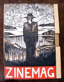
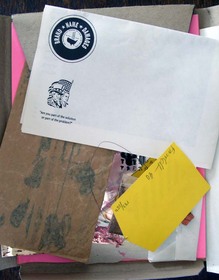
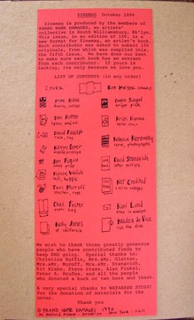
“… at 301 Bedford Avenue (at South First Street) is Brand-Name Damages, opened in December by an artists’ collective called the Justice League of America, whose members are mostly recent and current students at the nearby Pratt Institute. The 25 members, who pay $40 a month to support the gallery, meet on Sunday afternoons to determine their activities, which include a homemade magazine called Zinemag.”

Thank goodness New York Times art critic Roberta Smith included this comment in her survey of small, new Brooklyn galleries, published March 23 1990. Without it, we would never know what we had found when this uncatalogued issue of the periodical/artists’ book Zinemag turned up. No other copies are listed on OCLC or in Arcade, the catalog for members of the New York Art Resources Consortium (NYARC). We would certainly be interested in completing the run, if anyone kept their issues.

Zinemag, no. 5, October 1990. Edition: 150. Graphic Arts (GAX) 2010- in process

Roman diptych and stylus

| 2 Comments
diptych
diptych

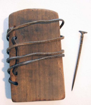
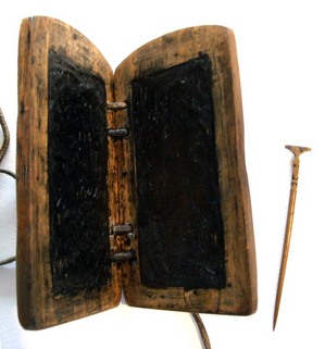
“A diptych is a sort of notebook, formed by the union of two tablets, placed one upon the other and united by rings or by a hinge. These tablets were made of wood, ivory, bone, or metal. Their inner surfaces had ordinarily a raised frame and were covered with wax, upon which characters were scratched by means of a stylus. Diptychs were known among the Greeks from the sixth century before Christ. They served as copy-books for the exercise of penmanship, for correspondence, and various other uses”. (See the Catholic Encyclopedia entry: [http://www.newadvent.org/cathen/05022a.htm])

Wax coated tablets (either singularly or in bound diptyches) provided an inexpensive, portable, and reusable writing surface. Today, we say “start with a clean slate,” after the clerics who would clear the wax surface of their tablets using the flat top of the writing stylus.

The wood diptych and bronze stylus in graphic arts measures 9.5 x 17 x 9.5 x 2 cm with four holes in each tablet bound together with a leather strap. It is assumed that our first curator, Elmer Adler, had this made for teaching.

For more on the history of writing, see Bernhard Bischoff (died 1991), Latin Palaeography: Antiquity and the Middle Ages (Cambridge; New York: Cambridge University Press, 1990). Firestone Z114 .B5713 1990
Aaron Burr's death mask

burr3
burr
burr1

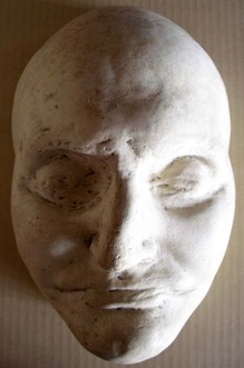
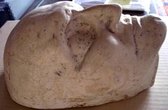
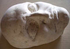
Aaron Burr Death Mask, 1836. (CO770) Gift of Laurence Hutton.

Author, essayist, and critic, Laurence Hutton (1843-1904) was a collector of death masks, which he donated to Princeton University. Although he had many stories about the collection, he was only completely sure of the provenance and authenticity of a handful. One of these was the mask of Aaron Burr, Class of 1772 (1756-1836).

A 1901 article in the New York Times entitled “Laurence Hutton’s Mask of Aaron Burr” provides the details. An unidentified author writes, “An elderly gentleman called to inspect what was familiarly called “The Skullery” in Mr. Hutton’s New York house, and particularly to make a study of the mask of Henry Clay … [whose authenticity] was doubtful.” After some time, the sculptor “was inclined to accept the authenticity of Clay. And he knew that Burr was Burr—for he had made it himself! He had not seen it for fifty years … but recognized it at a glance. As a young man employed in the construction of “specimens” for a firm of phrenologists, he had been sent to Staten Island the day after Burr died. And then and there he had performed the gruesome operation.”

In his book Portrait in Plaster, Hutton wrote that the mask was “made by an agent of Messrs. Fowler & Wells, who still posses the original cast. The features are shortened in a marked degree by the absence of the teeth. Mr. Fowler said that in Burr destructiveness, combativeness, firmness, and self-esteem were large and amativeness excessive.”

Aaron Burr was born in Newark, New Jersey, on February 6, 1756, son of Aaron Burr, a theologian and second president of the College of New Jersey (now Princeton University). He entered the College of New Jersey at age thirteen and graduated in 1772. Burr began his political career in 1784 and continued in politics … ultimately as Vice President of the United States under Jefferson. He lost his second candidacy for Vice President when he alienated Republican leadership with sympathies for the Federalists. Burr blamed much of his political downfall on Alexander Hamilton and his compatriots. After failing to force Hamilton to apologize for statements made against Burr in the gubernatorial race, Burr challenged Hamilton to a duel. When Burr killed the prominent politician, popular opinion cast him as a cold-blooded murderer, and warrants were put out for his arrest in New York and New Jersey. Burr fled to Philadelphia and then the South to escape capture. (taken from Princeton University Burr collection finding aid)

Recent Comments

  • Howard Coblentz: I have a round seal shaped like a pear a read more
  • John Overholt: Wikipedia's entry for Sir Francis says: "Throughout Baring's lifetime his read more
  • Serge Rodrigue: It is a precious thing you have a book from read more
  • Colin Wicks: I have a copy of “A Round Game.” And it read more
  • Laurence Hilonowitz: I was a Customer, Friend of Bob Wilson. I Live read more
  • allen scheuch: Absolutely STUNNING! Those colors, those designs made my day! Thanks, read more
  • Olivier: Hello Diane, If you are still looking for an examplare read more
  • Stella Jackson-Smith: I have a framed picture by A.Brouet, signed with the read more
  • John Podeschi: I remember Dale fondly from my days at Yale (1971-1980). read more
  • Joyce Barth: I have some or all of this same poem. I read more