This post is in honor of James Mosley, written in the hope that he will correct me.
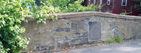
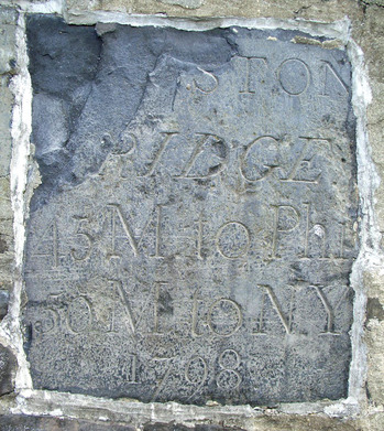
The second oldest stone bridge in New Jersey (and the oldest with a period sign), sits just outside Princeton along Route 27. Additional information can be found at: [http://www.alpsroads.net/roads/nj/nj_27/o.html]. The abbreviated text says: Kingston Bridge, 45 miles to Philadelphia, 50 miles to New York, 1798.
I was introduced to the bridge and its sign by Steve Ferguson, Curator of Rare Books, as we were returning from Rare Book School, where I studied typography with Mr. Mosley (http://typefoundry.blogspot.com/).
In 1776, Benjamin Franklin (1706-1790) chose the British typeface “Caslon” for the first printing of the American Declaration of Independence and for the Constitution. So the question is, when the Kingston Bridge was built in 1798, only twelve years after the American revolution, did they label it with a British font or a French font?
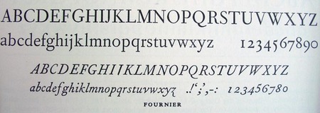
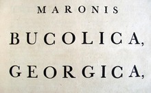
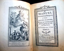
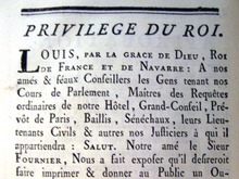
I was convinced that P. Dorn (the builder) did not use “Caslon,” so I looked at the British face by John Baskerville (1706-1775) developed in 1757 and a French romaine du roi designed by Fournier, le jeune (1712-1768) in 1742.
Examples of each were available in their books:
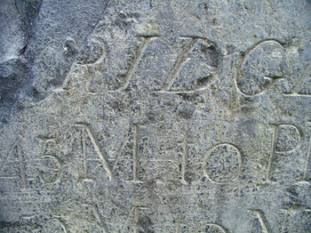
The M, N, Y could be either but the R appears French. The clearest distinction, to my eye, is in the figures or numbers, with a sweeping French lower case 7 and 9, and a curling 5. It is unfortunate there is no Q in Kingston.
So, does our little American bridge have a French face? I think so but I will wait to see whether my classmates agree. Or if the master will correct me.
*********
Well, I did, in fact, guess wrong. Mr. Mosley has kindly corrected me:
“That inscription of 1798 on the bridge is very handsome. I think its style is more Baskerville than Fournier — that is, more British than French — but then that is what one would expect.”
He continues, “Letters cut in stone in the old British colonies would naturally tend to show an influence from the former homeland, just as those made further north among the snows of Québec might — I imagine — have a certain echo of the work of French stonemasons.”


Re: 18th-Century Typography on the Road to Princeton
Thank you very much for a most interesting article.
The bridge does not sit "just outside of Princeton", but rather half the Bridge sits in Princeton Township (Mercer County) and a quarter sits in each of South Brunswick Township (Middlesex County) and Franklin Township (Somerset County.) The boundaries of all three townships (and counties) meet at the center of the Kingston Bridge. [When the bridge was built Mercer County did nor exist; the centerline of the road (and bridge) was then the boundary between Middlesex and Somerset Counties. Kingston has never been a municipality; what historicaly was Kingston now lies in four townships (in addition to the three afore mentioned three townships a small part lies in Plainsboro) and three counties.]
Having taugh typography 15 years ago, looking at the bridge font was a fun little test of my skills. I was correct in my choose of Baskerville; strickly because of the number 5. Of coarse, it had to be a font with English roots.
Fun! find some more bridges. I am from Middletown, NJ; the village area where there are many grave yards dating back as far as the mid 1600's, and a very historical area during the revolution. I never thought of looking at the fonts?!