Recently in Acquisitions Category

James Nasmyth and the Durable Image

nasmyth the moon15.jpg
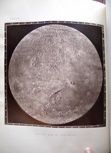
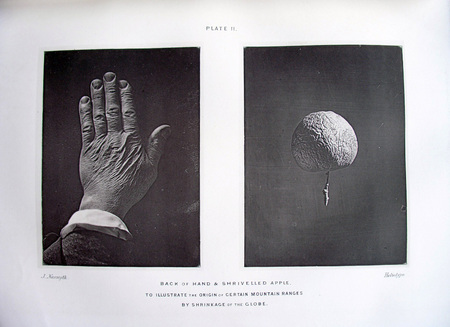
First edition, heliotype with thumb right

nasmyth the moon1.jpg
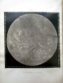
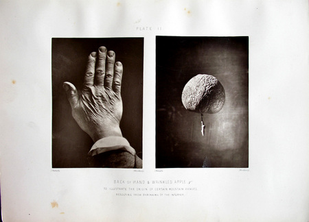
Second edition, woodburytype with thumb left

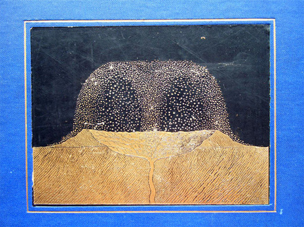
In 1874, the Scottish engineer James Nasmyth and London publisher John Murray prepared and released two simultaneous editions of Nasmyth’s study of the moon. Although the text and pagination is the same, the illustrations are not. Why?

Nasmyth was an amateur astronomer who built his own 20-inch reflecting telescope and made detailed observations of the moon. He was also an amateur photographer and experimented with various ways of making images of the moon. He drew, creating the plaster models, and photographed both the moon itself and his own reproductions.

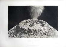
nasmyth the moon4.jpg1st ed., heliotype dated 1865
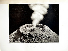
nasmyth the moon5.jpg2nd ed., woodburytype dated 1864

It was a time when many men and women were attempting to find the perfect form of reproduction: the durable photograph. One that would not fade or change over time AND could be printed in ink (independent of the action of light), so it could be made on cloudy days.

Heliotypes, autotypes, and woodburytypes were only a few of the non-silver prints made from photographic negatives. Each had their own drawbacks, especially the beautiful woodburytype, which was the most time-consuming. Some publishers preferred the heliotype, which did not have the glossy surface of the woodburytype or the albumen photograph. The autotype was the quickest but didn’t have the detail of the others.

nasmyth the moon12.jpg
nasmyth the moon11.jpg
Both woodburytypes, one with pigment?

Is it possible that Nasmyth and Murray were experimenting with book illustration, to see which edition would remain true longer? If so, the woodburytype won because the third edition of this book, published in 1885, is listed as having only woodburytypes (not held at Princeton).

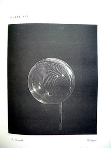
nasmyth the moon9.jpg1st ed., single heliotype
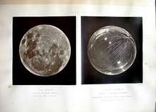
nasmyth the moon10.jpg2nd ed., two woodburytypes
nasmyth the moon8.jpg

1st ed., front cover

James Nasmyth (1808-1890) and James Carpenter (1840-1899), The Moon: Considered as a Planet, a World, and a Satellite. 1st edition (London: John Murray 1874). Graphic Arts Collection GAX 2012- in process. With 23 plates, including 6 photogravures, 4 heliotypes, 2 lithographs and 1 chromolithograph after drawings or photographs by Nasmyth, 12 mounted photographs on 11 leaves (10 autotypes by Brooks, Day & Son and 2 woodburytypes), and various wood engravings with text.

James Nasmyth (1808-1890) and James Carpenter (1840-1899), The Moon: Considered as a Planet, a World, and a Satellite. 2nd edition (London: John Murray 1874). Graphic Arts Collection GAX Oversize 2003-0202Q. Note, frontispiece and plates XII, XIII XVI, and XX are photogravures in the first edition, woodburytypes in second edition; plates II, XIX, XXI, XXIII in first edition are heliotypes, woodburytypes in second edition; plate XIX in first edition has one illustration (glass globe cracked) and two illustrations in second edition (add the full moon); plate III is woodburytype in both editions, but larger in first edition; plate XIV is woodburytype in both editions, but smaller in first edition.
Engraved on steel

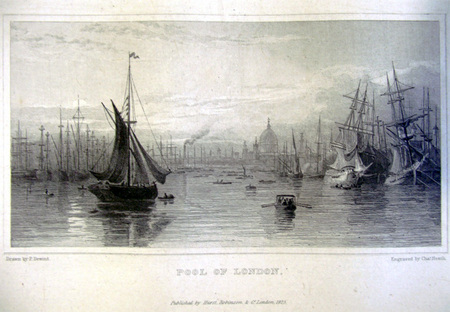
heath views of london1.jpg
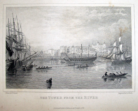
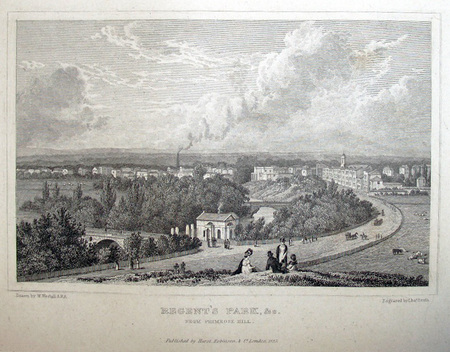
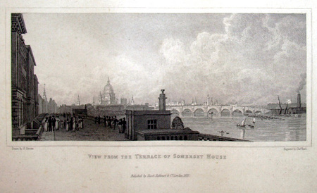
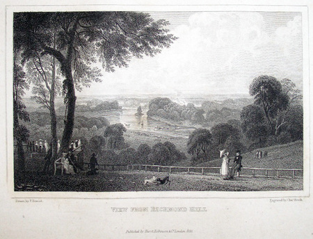
Views of London. 45 plates engraved by Charles Heath (1785-1848) (London: Hurst, Robinson & Co., & R. Jennings Year: 1825). Each plate accompanied by a leaf with descriptive letterpress. Graphic Arts Collection GAX 2012- in process

Charles Heath made his first etching when he was six years old and in 1840, was responsible for engraving on steel the world’s first postage stamps. It is his skill engraving on steel rather than copper, for which he is best remembered today.

“Heath was also a pioneer in new printmaking techniques… . In 1820, for an edition of Thomas Campbell’s poem Pleasures of Hope, he engraved the first plates on mild steel rather than copper, giving much longer production runs from each plate. In larger commercial plates he was less successful. By contrast his View from Richmond Hill and his Gentlemen of the Time of Charles I, together with his Christ Healing the Sick, were masterpieces of their kind.

In 1821 and again in 1826, Charles Heath got into financial difficulties, but quickly recovered following an energetic diversion into the new fashion for illustrated annuals and giftbooks… . From 1825 onwards he was almost entirely occupied first in engraving for The Amulet, Literary Souvenir, and Landscape Annual, and then in promoting his own productions, notably The Keepsake, Picturesque Annual, the Book of Beauty, and similar publications such as J. M. W. Turner’s Picturesque Views in England and Wales.” Dictionary of National Biography

heath views of london2.jpg
heath views of london3.jpg
heath views of london4.jpg
heath views of london5.jpg

Advertising The Sunday World

sunday world group 3.jpg
sunday world group 2.jpg
sunday world group 1.jpg

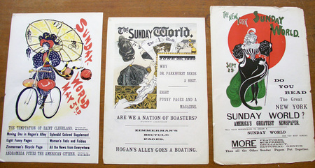
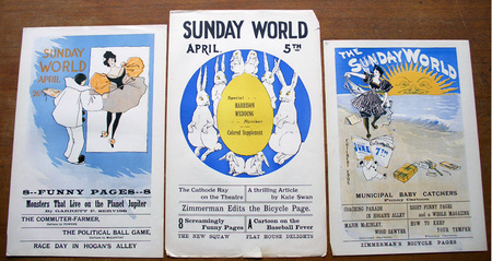
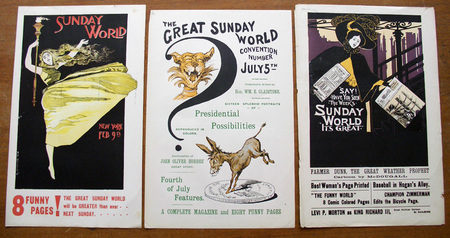
F. Gilbert Edge (active 1890s), Advertising posters for The Sunday World, [1896]. Color printed letterpress posters. Graphic Arts Collection GAX 2012- in process

We recently acquired nine color letterpress advertisements for Joseph Pulitzer’s Sunday World, the heavily illustrated Sunday edition of his daily newspaper The New York World. Pulitzer increased his advertising in 1895, when William Randolph Hearst established a rival paper The New York Journal and the two vied for subscribers.

Note in particular the announcement of an article by Garrett Putnam Serviss (1851-1929) describing “Monsters That Live on the Planet Jupiter.” Serviss was a trained astronomer with degrees from Cornell and Columbia, who wrote early science fiction. He published an unauthorized sequel to War of the Worlds by H. G. Wells, called Edison’s Invasion of Mars. This was followed by a second book about life on Venus and a third about the Moon. His story about Jupiter never made it beyond the pages of The Sunday World.

Fanny Palmer

palmer new york drawing4.jpg
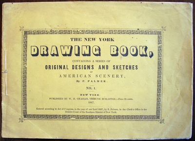
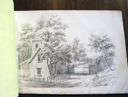
Frances Flora Bond (Fanny) Palmer (1812-1876), The New York Drawing Book: Containing a Series of Original Designs and Sketches of American Scenery, No. 1 (New York: William H. Graham, 1847). Lithographs. Graphic Arts GAX 2012- in process

palmer new york drawing3.jpg

Fanny Palmer created over 200 lithographs for the Currier & Ives publishing company and is regarded as one of the leading commercial illustrators of her time. Born in Leicester, England, she married Edmund Seymour Palmer at the age of twenty and immigrated to United States a few years later.

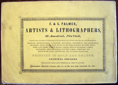
In the 1840s, Mr. and Mrs. Palmer set up a lithographic printing business called “F&S Palmer,” with Fanny drawing and Edmund printing the stones. The company was not successful and this drawing book was one attempt to begin a commercial series that would save the business. Priced at 25 cents, it did not sell well and the series ended with No. 1.

After going bankrupt, Fanny joined Nathaniel Currier as one of his leading staff artists. Palmer’s work was well received until 1857, when James Ives became Currier’s partner and began to redraw the figures in her pictures. She stuck it out, retiring in 1868 at the age of sixty-six.

palmer new york drawing2.jpg

See also: http://libweb2.princeton.edu/rbsc2/ga/unseenhands/printers/palmer.html

Fuse 1-20, with antimatter

fuse magazine8.jpg

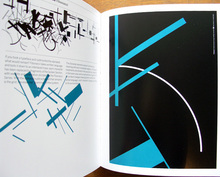
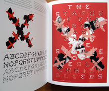
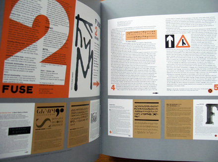
Neville Brody, Adrian Shaughnessy, and Jon Wozencroft, FUSE 1-20: From Invention to Antimatter: Twenty Years of FUSE (Köln: Taschen, 2012). 1 book (411 p.), 10 posters, 1 keycard. Graphic Arts GA2012- in process

fuse magazine3.jpg
fuse magazine2.jpg

Adrian Shaughnessy writes, “Under Brody’s art direction, early Fuse stuck pins in the eyes of typo traditionalists and gleefully invited the displeasure of graphic design’s self-appointed ruling elite by simultaneously showing how typography, thanks to the computer, had become open to all comers and showing how it had been freed of its traditional purpose of conveying linguistic meaning.”

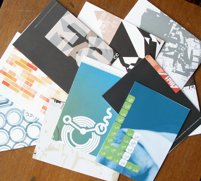
Launched by Neville Brody and Jon Wozencroft in 1991, FUSE was a forum for digital and experimental typography. Produced with FontShop International in Berlin and FontWorks in London, each quarterly issue was delivered in a cardboard box with a disk of new digital fonts, a couple large posters, and a colorful magazine (or booklet). Issues were constructed around a theme, through which the editors hoped would explore “the unmapped potential of the new digital technology.”


fuse magazine1.jpg

Twenty years after that original launch, the out-of-print issues have now been reissued in this new limited edition. The box comes with a little credit card providing access to a computer database of fonts, which we are welcome to download and use as much as we want. There are ten poster from issues 19 and 20, and a 400 page glossy text of both old and new material, sure to shock the typographic community all over again.
fuse magazine7.jpg


Reflex camera

| 1 Comment
reflexcamera3.jpg
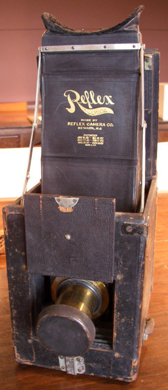
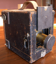
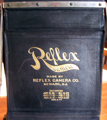
Reflex camera, ca. 1905. Made by the Reflex Camera Company,
Newark, New Jersey. Adjustable lens by Voigtländer & Sohn, Braunschweig, Germany. Gift of anonymous donor.
reflexcamera2.jpg


reflexcamera1.jpg

On December 4, 1942, The New York Times posted an obituary for Louis Borsum (1856-1942), who “developed the Reflex Camera and Metal Polish.” Borsum died at the age of 88, a retired inventor living in East Orange, New Jersey. Originally from Germany, Borsum was a pioneer in the development of photography equipment. His first patent was filed in 1891 and a later variation on the Reflex camera, shown here, was patented in 1895. Unfortunately, the business did not last long and the development of a single reflex camera was left to others.

Not much information on Borsum has been recorded. A small notice was published in a 1906 Photo-Era magazine and then, picked up in Camera: a Practical Magazine for Photographers, stating “A new aspirant for honors, in the convention this year, was the Borsum Camera Co., Jersey City, N. J., manufacturers of the Reflex Camera. The new Reflex has been much improved; it is lighter and simpler than ever before, and the sale promises to be large, as was demonstrated at the convention, where Messrs. Borsum and Fiedler made many friends.”

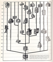
See where this camera stands within a timeline of photographic equipment, as shown in: Douglas B. Tubbs, The Illustrated History of the Camera from 1839 to the Present (New York Graphic Society, 1975). Marquand Library (SA) Oversize TR250 .T82 1975q

reflexcamera history page.jpg

Où diable l'amour va-t-il se nicher!

ou diable lamour.jpg
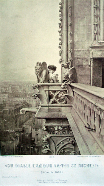
Photographer unknown, after a painting by Édouard de Beaumont (1821-1888) after a photograph by Charles Nègre (1820-1880), Où diable l’amour va-t-il se nicher! 1873. Albumen silver print. Graphic Arts GA2012- in process

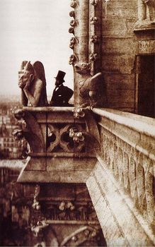
376px-Henri_Le_Secq_near_a_Gargoyle.jpgCharles Nègre (1820-1880) The Vampire, 1853 (c) Musée d’Orsay
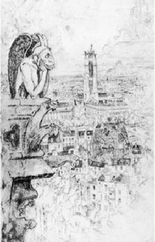
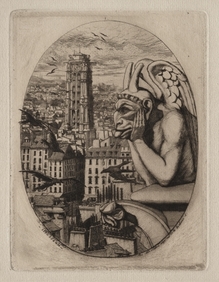
1940.889.jpgCharles Meryon (1821-1868), Le Stryge, 1853. (c) Cleveland Museum of Art
318-02c45db35d.jpg Joseph Pennell, Le Stryge, 1893.
(c) Art Institute of Chicago
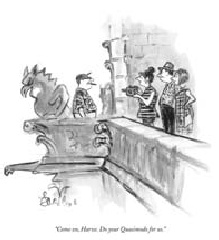
354-191145a9d0.jpgEdward Frascino, “Come on Harve. Do your Quasimodo for us!” 15 July 1972. (c) The New Yorker

In 1844, Édouard de Beaumont (1821-1888) was one of several artists asked to illustrate a new edition of the novel Notre-Dame de Paris by Victor Hugo (1802-1885). First published in 1831, the book was an enormous success and the 1844 edition was to be a sumptuous new printing with two dozen new engravings.

The popularity of Hugo’s book not only resulted in multiple editions in many languages but also in the restoration of the Cathedral of Notre Dame itself. Beginning in 1845 and lasting for twenty-five years, the controversial rebuilding included the addition of the gargoyles on the Galerie des Chimères.

Many visual artists were inspired to create images of the structure, using in particular the gargoyles as romantic icons. Charles Nègre (1820-1880) and Henri Le Secq (1818-1882) playfully photographed each other on the north tower in 1853 and Nègre’s image remains a favorite in museum collections around the world. Views of “The Vampire” looking out over the city of Paris turned up everywhere, including an etching by Charles Meryon and later, a painting by Winslow Homer.

Twenty years after Nègre made his photograph, Beaumont was inspired to revisit the theme in a painting he called “Où diable l’amour va-t-il se nicher!” Historians have translated this enigmatic title several ways, offering “Where the devil will love nest,” “Where will Devil Love nest,” or “Where the hell is love going to nest!” among other variations. Rather than drag his easel up all those stairs, Beaumont simply copied the major portion of the photograph exactly, substituting only the portrait Le Secq for a couple in love (the woman in a startlingly green dress).

Beaumont’s painting was not only accepted into the Salon of 1873 but won second prize. An engraving of the painting was made by Léon Gaucherel and the French firm Goupil et Cie. had both an albumen photograph and a woodburytype created. They first sold them as part of their series Galerie photographique and then, published the woodburytype in their sumptuous journal Galerie contemporaine littéraire, artistique (v. 8, 1884) along with a portrait of the artist and several other paintings.

For more variations on the Vampire theme, see the wonderful study by Michael Camille, Gargoyles of Notre Dame: Medievalism and the Monsters of Modernity (Chicago: University of Chicago Press, 2009). Marquand SA NA3549.P2 C36 2009


Jean-Martin Charcot's Visual Psychology

iconographie14.jpg
Désiré Magloire Bourneville (1840-1909) and Paul Regnard (1850-1927), Iconographie photographique de la Salpêtrière. Service de M. Charcot (Paris: Adrien Delahaye & Co., 1876-1877, 1878). Graphic Arts Collection GAX 2012- in process

iconographie1.jpg
iconographie11.jpg

As a young professional Jean-Martin Charcot (1825-1893) served his internship at Salpêtrière, a women’s hospital in Paris used as more of “a warehouse for female outcasts: women who were mad, violent, crippled, chronically ill, mentally retarded, unmarried and pregnant, or simply old and poor.” Charcot called it “that grand asylum of human misery.” [Medical Muses, 2011]

In 1862, Charcot returned to Salpêtrière as chief physician of medical services and transformed it. During his tenure, the hospital grew to house more than 5,000 patients in 100 buildings; the largest institution of its kind in Europe. It had its own farm, bakery, and by 1878, a well-equipped photography studio. (Bellevue Hospital in New York City also had a full photography department.)


iconographie2.jpg
iconographie10.jpg
iconographie7.jpg

Asti Hustvedt writes, “Charcot … brought hysteria, hitherto marginal, into the mainstream. He legitimized the disease by defining it as an inherited neurological disorder, not madness or malingering.” Martin Kemp noted that the doctor’s work was “an unrivaled attempt to create what may be called ‘visual psychology’ —in which imagery and environments played a central role in diagnosis, recording, clinical suggestion, treatment and the design of the patients’ surroundings.”

Charcot was deeply influenced by his predecessor at Salpêtrière, Guillaume-Benjamin Duchenne de Boulogne who published his treatise Mécanisme de la physionomie humaine in 1862. Six years earlier, Duchenne had begun photographing his patients, thanks to the help of Adrien Tournachon (Nadar’s brother), as a form of “orthography of the physiognomy in motion.” Charcot began to do the same.

iconographie3.jpg

In 1875, he selected as an intern a young psychiatry student named Désiré-Magloire Bourneville, who was also a journalist. Bourneville wrote extensively for medical journals and eventually, published two of his own. Under Charcot, he learned to keep extensive medical histories on the patients, many of which were later published in Iconographie. It is thanks to Bourneville that Charcot’s many accomplishments became known both in his own time and today.

iconographie8.jpg
iconographie4.jpg

Another intern, Paul Regnard, was hired, in part, for his ability to make photographs. Charcot hoped these would provide visual evidence to support his conviction that hysteria was a real organic disease with particular symptoms. In 1882, photographer Albert Londe (1858-1917) was hired as a chemistry assistant and before long, took over the running of the photography laboratory. Londe published his own study in 1893 entitled La photographie médicale: application aux sciences médicales et physiologiques, dedicated to Charcot.

iconographie9.jpg

“The photographs in the Iconographie haunt its pages,” writes Hustvedt, “[they are] the ghosts of women who refuse to be reduced to medical illustrations.”


See also:
Asti Hustvedt, Medical Muses: Hysteria in Nineteenth-Century Paris (New York: W.W. Norton & Co., 2011). Firestone RC339.52.C453 H87 2011

Ann Thomas, Beauty of Another Order: Photography in Science (New Haven, CT: Yale University Press in association with the National Gallery of Canada, Ottawa, 1997). Marquand Library (SAPH): TR692 .T466 1997

Reason Speaks and Pleasure Carries One Away

rogers.jpg
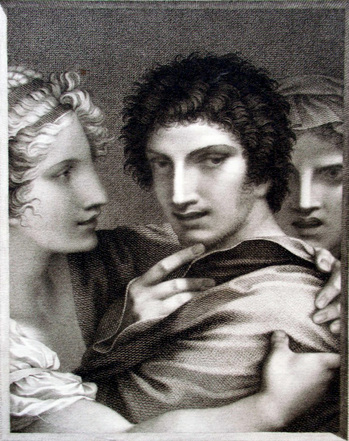
Barthélemy Roger (1767-1840) after a drawing by Pierre-Paul Prud’hon (1758-1823), La raison parle, et le plaisir entraîne (Reason Speaks and Pleasure Carries One Away), ca. 1796-1799. Stipple engraving. Goncourt 78.ii; Laveissière 80-81.36; Beraldi XI.229. Graphic Arts Collection. GA2012-02315. Gift of Mary M. Schmidt.

“In order to succeed in what was for printmakers a perilous period, Prud’hon had to have more than sensitivity to contemporary taste,” notes Elizabeth Guffey. “Prud’hon’s print Love Reduced to Reason, which went on sale in later 1793 … was an unqualified success… . [The artist] followed it up with a series of similar projects, including Virtue Struggling with Vice: Reason Speaks, Pleasure Entraps; Love Caresses Before It Wounds; Innocence Prefers Love to Wealth; and Love Seduces Innocence, Pleasure Entraps, Remorse Follows.

Unlike many artists who allowed the publisher to handle the printing, publication, and sale of their work, Prud’hon kept a hand in every aspect of the process. His prints sold for as much as 7 livres (compared to the 3 livres charged for prints by Jacques-Louis David, 1748-1825). The investment and the sale of Prud’hon’s work was shared between his publisher and friend Constantin, the engraver (in this case Roger), and the artist.

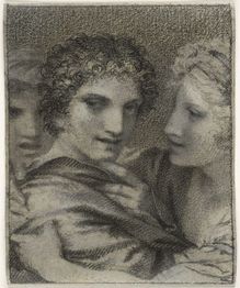
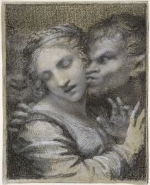
For this print, Reason Speaks and Pleasure Carries One Away (also translated Pleasure Entraps), Prud’hon made two drawings, one ink and the other in two colors of chalk. Both are in the collection of the Fogg Art Museum. It may be that the artist and the engraver were considering a two color engraving, although no example of this has been found. Also shown below is the similar Virtue Struggles with Vice.

urn-3 HUAM 50735_dynmc.jpg(c) Fogg Art Museum
urn-3 HUAM 50734_dynmc.jpg(c) Fogg Art Museum

[left]: Prud’hon, La Raison parle et le Plaisir entraîne (Reason Speaks and Pleasure Carries One Away), ca. 1795-1799. Chalk drawing. Harvard Art Museums/Fogg Museum, Bequest of Grenville L. Winthrop, 1943.888
[right]: Prud’hon, La Vertu aux prises avec le Vice (Virtue Struggle with Vice), ca. 1795. Chalk drawing. Harvard Art Museums/Fogg Museum, Bequest of Grenville L. Winthrop, 1943.884

See also:
Elizabeth E. Guffey, Drawing an Elusive Line (Newark, Del.: University of Delaware Press, 2001). Marquand Library ND 553.P9G83 2001

Books During Prohibition

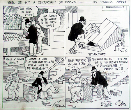
kessler3.jpg

Camillus Kessler (active 1920s), When We Get a Censorship of Books, no date [ca. 1925]. Pen and ink drawing. Graphic Arts Collection GA 2012.02310. Gift of Charles Rose, Princeton University Class of 1950, P77, P80.

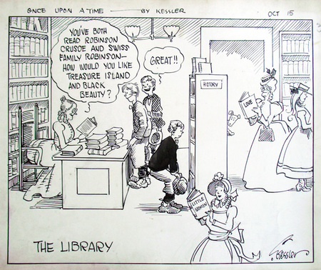
kessler2.jpg

Camillus Kessler (active 1920s), Once Upon A Time: The Library, no date [ca. 1925]. Pen and ink drawing. Graphic Arts Collection GA 2012.02282. Gift of Charles Rose, Princeton University Class of 1950, P77, P80.


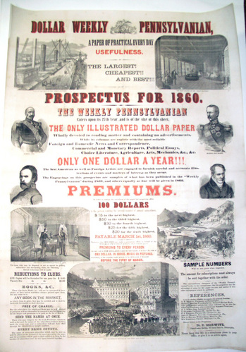
dollar2.jpg
Prospectus for the Dollar Weekly Pennsylvanian, 1860. Two-color broadside. 42 x 29 1/2 inches (106.7 x 74.9 cm.). Graphic Arts Collection GAX 2012- in process

The Dollar Weekly Pennsylvanian ran from 1854 to 1861 under the editorial control of Dr. Edward Morwitz (1815-1893), a physician turned newspaper publisher. Morwitz also ran the German-language newspaper Demokrat and the weekly Vereinigte Staaten Zeitung (United States Journal), using all his papers to advocate for his political views.

There were many other papers run by Morwitz. This broadside mentions the reuse of “cuts” and stories from his five other newspapers. Biographer Henry Samuel Morais writes that Morwitz “controlled, perhaps, more newspapers than any other man, having under his management at one time as many as three hundred of these, and among them eight dailies…”


dollar4.jpg
dollar1.jpg

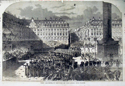
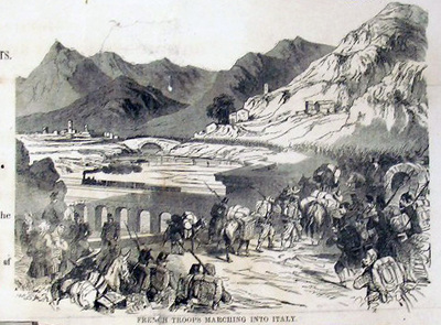
The large wood engravings on this sheet illustrate the newspaper’s extensive coverage of foreign news, offering scenes of the Second Italian War for Independence (also called the Franco-Austrian War). There are also portraits of Giuseppe Garibaldi, Adolphe Niel, Patrice MacMahon, and Alexander von Humboldt.

See also: Henry S. Marais (1860-1935), The Jews of Philadelphia (Philadelphia: Levytype Co., 1894). Firestone Library (F) F158.9.J5 M8 1894

dollar5.jpg

Historical Bookbinding Models

teachingbindings2.jpg
teachingbindings3.jpg
teachingbindings1.jpg

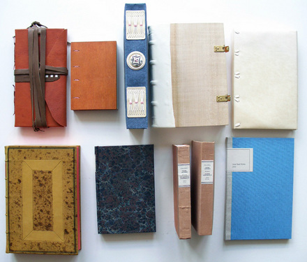
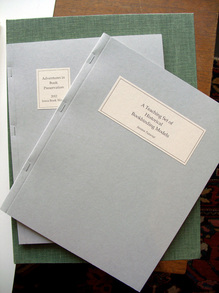
Graphic Arts now holds a 2012 Teaching Set of Historical Bookbinding Models, thanks to Iowa Book Works, a small enterprise founded by Joyce Miller and Gary Frost that specializes in production of book craft kits. http://iowabookworks.bookways.com/?page_id=34

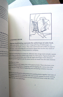
Included in an enormous clamshell box are ten model bindings, along with two instruction booklets. The history and culture of each binding is described, followed by notes on the “handling and action” of each volume (how it feels in your hand, how it opens, etc.). In this way, the student not only learns the definition of a book structure but how to recognize it when they hold one.

“These bookbindings illustrate the appearance and structure of common books in different cultures and across time,” writes Frost. “As you read the descriptions for the individual types investigate their physical features and mechanical actions. Handling of these model bookbindings will provide a lasting impression of the innovations and changes in the mechanism of the codex book. Each bookbinding model exemplifies specific attributes of the codex structure, and the array of books together tells a story of a persistent mechanism for reading.”

Samples include:
1. Papyrus book
2. Ethiopian book
3. Account book
4. Wooden board book
5. Vellum binding
6. Leather binding
7. Paper case binding
8. In-boards cloth binding
9. Cased cloth binding
10. Contemporary binding

Le pavillon sur l'eau

| 2 Comments
pavill 2.jpg
pavill 7.jpg
pavill 1.jpg

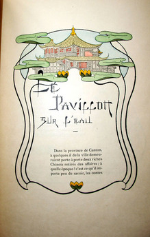
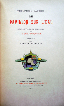
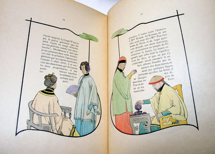
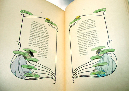
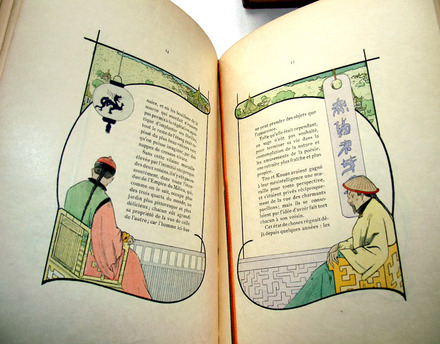
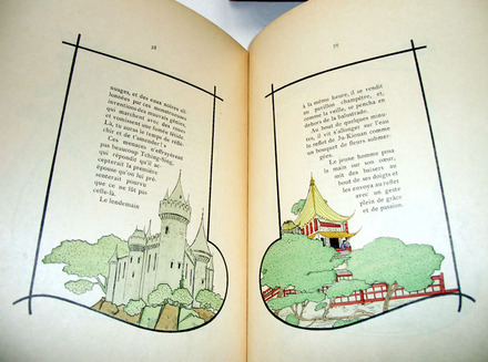
Le pavillon sur l’eau (The Water Pavillion). Translated by Théophile Gautier (1811-1872). Illustrated by Henri Caruchet. Preface by Camille Mauclair (1872-1945). Paris: A. Ferroud, 1900. One of 80 large paper copies. Graphic Arts GAX 2012-0243N

pavill 6.jpg
Gautier’s translation of The Water Pavillion from Chinese to French wasn’t the first. Jean-Pierre Abel-Remusat (1788-1832), a Chinese literature scholar, published a translation of the folktale in 1827. Gautier followed with his own version in 1846, and included it in his 1852 compilation La Peau de tigre (The Tiger Skin). Paris art publisher Ferroud used the last for his 1900 limited edition.
pavill 5.jpg
pavill 4.jpg
pavill 3.jpg

American Comic Strip Printing Plates and Drawings

cartoonplate8.jpg

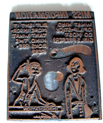
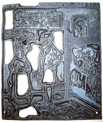
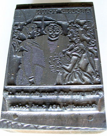
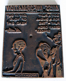
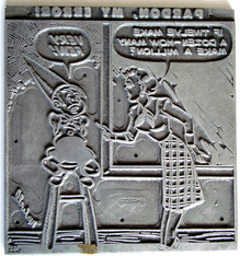
Thanks to the generous donation of Charles Rose, Class of 1950, P77, P80, Graphic Arts now holds 1429 zinc and aluminum printing plates for comic strips syndicated to American newspapers from the 1920s to the 1950s. The plates originated with Abraham Meyers, whose American Melody Company or Meyers List (newspapers knew the firm as International Cartoons or Empire Features) was founded in 1898.

At first a distributor of sheet music, Meyers transitioned to comic strips in the early 20th century. One package of zinc printing plates was shipped to each newspaper at the beginning of the month and then returned. There was no sequence or simultaneous publishing of comics in city papers around the country.

In 1934, the firm passed to J.R. Kramer and then, to Kramer’s son-in-law Charles Rose, who bought out the company in 1967. He and his wife ran the business until the Meyers List was dissolved on March 20, 1977.

cartoonplate10.jpg
cartoonplate3.jpg

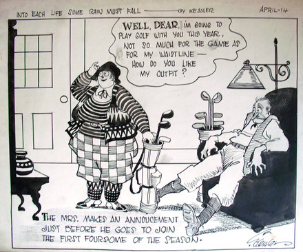
In addition to the plates, record books for the business, various teaching materials, and several albums of published strips, Princeton received 86 original pen and ink drawings for cartoons by Camillus Kessler, an active but little documented cartoonist. Kessler published comics in the New York Globe and Advertiser, New York Evening Graphic, New York World, and other papers from around 1914 into the 1940s.

Firestone Library holds two compilations of Kessler’s work: At the Bottom of the Ladder (Philadelphia: J.B. Lippincott Co., 1926). NC1320 .K44 and Twenty-Five Years Ago (New York: Coward-McCann, 1931). NC1320 .K45.

cartoonplate7.jpg
cartoonplate6.jpg

Most recognizable of the printing plates are the 652 zinc two and four panel plates of Just Kids drawn by New York cartoonist August Daniel “Ad” Carter (1895-1957). The strip began in the summer of 1923 and ended with Carter’s death in 1957.

Also included are 52 zinc printing plates for Betty’s Beanery by Samuel Maxwell “Jerry” Iger (1903-1990), who had a partnership with Will Eisner (1917-2005); 32 single cell zinc printing plates for The Debunder by John Henry Fudray; and 15 single cell electrotype plates for Miss Information drawn by Barnet Cohen.

cartoonplate9.jpg

There are 52 two cell zinc plates for Hospital Quips by Rube Weiss, who is also known for Have Fun!, Josh Billings Sez, and Live ‘n Laff; 8 plates for Things That Never by Gary Bryne; and 7 for That Little Gamer by Link.

201 five panel zinc plates are for the comic strip Huckleberry Finn by Dwig and 200 aluminotype plates for the six panel strip called Squire Edgegate by Louis Richard. The longest plates are for seven panel comic strips. There are 100 for Bull Run by Carl Ed, who historians known as the creator of Harold Teen, and 110 for Raising the Family a comic strip from the 1920s and 1930s by an artist only known as Fisher.

We would be grateful for more information on these artists.

cartoonplate5.jpg
cartoonplate2.jpg
cartoonplate1.jpg


Special thanks to Mike Siravo and John Walako for helping to move these very heavy printing plates.

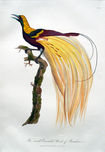
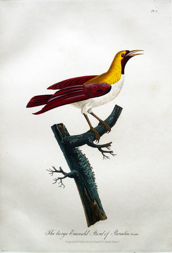
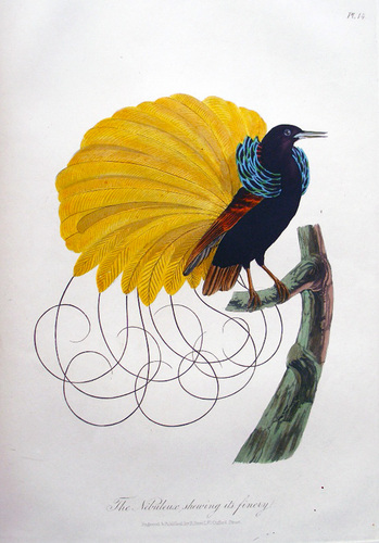
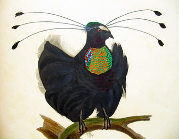
A Collection of the Birds of Paradise

havell14.jpg
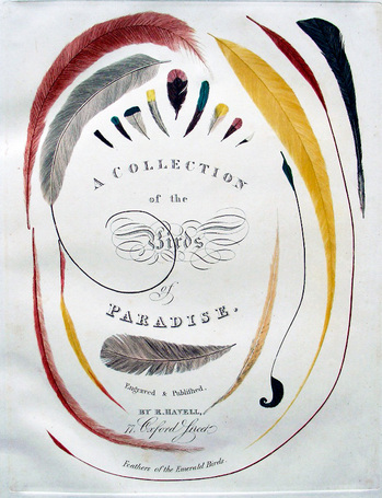
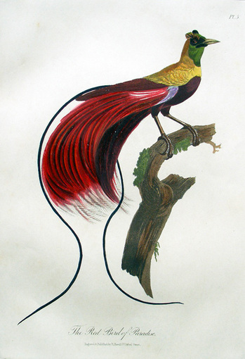
Robert Havell Jr. (1793-1878), A Collection of the Birds of Paradise ([London: R. Havell], no date but attributed to 1835). Engraved title page and 22 full-page hand colored aquatints. Signed on flyleaf: R[obert] Lionel Foster, 9 Terlingham G[ar]d[e]ns, Folkestone. Also owned by Major General Sir Rohan Delacombe. Purchased with funds from the Henry Matthews Zeiss Memorial Book Fund, the Graphic Arts collection, and the Princeton University Library. Graphic Arts GAX 2012- in process

index.php.jpg
index2.php.jpg
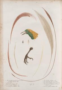
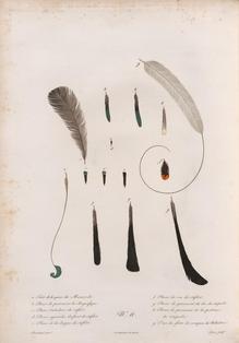
Havell’s book was inspired by the ornithological study, Histoire naturelle des oiseaux de paradis et des rolliers (1801-1806), drawn by Jacques Barraband (1767?-1809) and stipple engraved by Louis Bouquet (1765-1814) for François Le Vaillant (1753-1824). Above left, v. 1, plate 3 and above right, v. 1, plate 11. Images (c) NYPL digital website

havell brochure 3.jpg

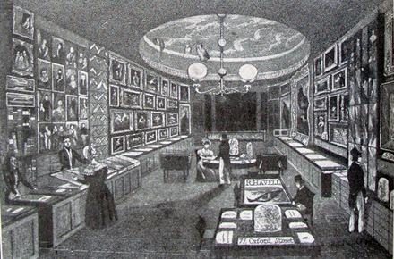
Robert Havell’s shop, The Zoological Gallery, at 77 Oxford Street, London. Image reproduced in Francis Hobart Herrick, Audubon the Naturalist (1917).

havell11.jpg

The Graphic Arts Collection recently acquired one of the rarest and most beautiful of Havell’s solo publications, A Collection of the Birds of Paradise (ca. 1835). While the volume was based on Le Vaillant’s earlier study, Havell redesigned several key artistic elements, beginning with the title page. In an act of inspired creativity, he selected elements from two individual pages that examined the plumage of the males and reconfigured the elongated and elaborate feathers into a compelling title cartouche.

havell12.jpg

Birds of Paradise was produced during the mid-1830s at Havell’s spacious Oxford Street shop, the Zoological Gallery, where he sold ornithological prints and drawings as well as the birds themselves, stuffed and posed, along with skins or feathers. Havell hunted these birds and other small animals outside London and then, prepared them for sale using his own techniques (Yale University Library holds a notebook where Havell recorded varieties of household recipes and taxidermist instructions).

havell15.jpg

All aspects of engraving, printing, coloring, bindings, and publishing were available at the Zoological Gallery, thanks to the enormous staff of young women Havell and his wife boarded, trained, and employed. One advertisement reads, “Miss Havell’s Boarding Establishment for a limited number of Young Ladies, in which the comfort and happiness of a home are combined with every instruction suitable to the capacity and age of the Pupils, who are received by the Month or Quarter. Terms may be had at the Zoological Gallery.”

havell16.jpg

Havell and Audubon were both members of the Zoological Society (instituted 1825) and well acquainted with all the illustrated natural histories, yet it may have been at Audubon’s suggestion that Havell took on the engraving of Le Vaillant’s study. As a young man, Audubon studied briefly in Paris when the original volumes were being released and he owned many of Le Vaillant’s luxurious color plate books in his own library (Audubon’s copy of Histoire naturelle des oiseaux d’Afrique (1799-1808) is now in Cornell University’s library).

havell10.jpg

Most recently this book belonged to Major General Sir Rohan Delacombe, KCMC, KBE, CB, DSO, KSt (25 October 1906 - 10 November 1991) who was a British military officer. He was the last British Governor of Victoria, Australia. Sir Rohan was appointed as Governor of Victoria in 1963 and his term ended in 1974. Upon his death in 1991, this particular item was part of his library in Australia and was left to his daughter.


Epithalamium by Paul Muldoon

muldoon2.jpg
muldoon1.jpg
muldoon3.jpg
muldoon4.jpg

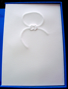
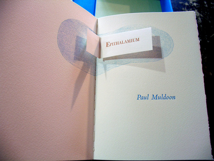
Paul Muldoon, Epithalamium. Designed and illustrated by Debra Weier (Princeton, N.J.: Emanon Press, 2011). Copy 6 of 50. Gift of Leonard L. Milberg, Class of 1953 in honor of Richard M. Ludwig. Ex 2012-0017Q

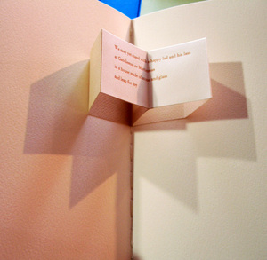
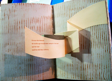
Epithalamium, a wedding poem by Pulitzer Prize winning Paul Muldoon, was designed, printed and bound by Debra Weier of Emanon Press. The book was conceived and produced over four years and seven months, and completed in May of 2011. Each of the seven verses claims its own page and is nestled in its own popout, and each popout symbolizes its respective verse through its structure.”—Prospectus inserted.

Additional images can be found at: http://debraweier.com/books/muldoon/muldoon.html

Oxford English Dictionary:
Epithalamium, n.: A nuptial song or poem in praise of the bride and bridegroom, and praying for their prosperity.
1595 Spenser (title) Epithalamion.
c1600 Timon (1980) iii. v. 49 Sing vs some sweete Epithalamion.
1607 J. Marston What you Will ii. i, Epythalamiums will I singe.
1653 Cloria & Narcissus I. 81 To sing Epithalamions to our marriage Feasts.
1690 T. Burnet Theory of Earth iv. 168 The 45th psalm‥is an epithalamium to Christ and the Church.
1739 W. Melmoth Fitzosborne Lett. (1763) 339 Give me timely notice of your wedding day, that I may be prepared with my Epithalamium.
1828 T. Carlyle Crit. & Misc. Ess. (1857) I. 163 Epithalamiums, epicediums.
1859 J. C. Hobhouse Italy II. 210 The Epithalamiums of Catullus and of Statius.
1860 G. J. Adler tr. C. C. Fauriel Hist. Provençal Poetry iv. 67 The epithalamia belonged likewise to the popular class of poetry.
2011 P. Muldoon Epithalamium

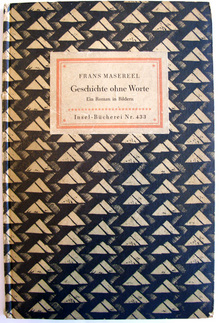
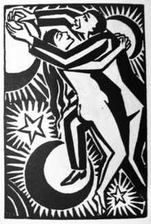
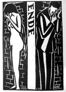
Geschichte ohne Worte

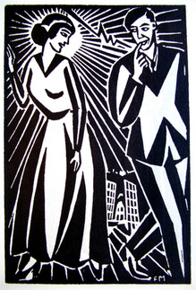
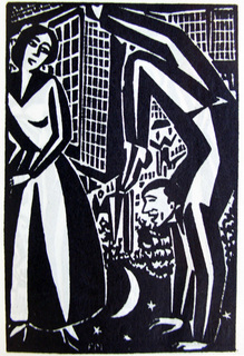
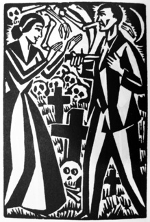
Frans Masereel (1889-1972), Geschichte ohne Worte: ein Roman in Bildern (Story Without Words: a Novel in Pictures). Afterword by Hermann Hesse. (Wiesbaden: Insel-Verlag, 1952 [first published 1922]). Gift of Seth Fagen. Graphic Arts GAX 2012- in process
masereel8.jpg
masereel9.jpg
masereel10.jpg
masereel12.jpg
masereel13.jpg
masereel11.jpg

Hermann Hesse (1877-1962) was a great admirer of Frans Masereel. In his afterword Hesse writes, “Der Mensch dieser Bilderfolgen, dessen Gestalt und Züge zuweilen denen des Künstlers selbst ähneln, ist der Adam unsrer Zeit; im Gewand des Heute erlebt er das ewig Menschliche, erleidet es, sucht es zu bestehen, erliegt ihm oder überwindet es. Ihn zu verstehen, mit ihm aufzuglühen in leidenschaft, niederzusinken in Verzweiflung, in ihm ans selbst zu erkennen und in seinem Leben das allen Gemeinsame zu verehren; das is die Mahnung dieses Künstlers.”
(The human beings in these picture sequences, whose form and features sometimes resemble those of the artist himself, are the Adam of our time; [Masereel] presents a universal man in contemporary dress, who suffers, struggles to exist, succumbs to life or overcomes it. To understand him, to burn with passion along with him, to sink into his despair, to recognize oneself in him and to admire the universal in his life; this is the reminder of the artist.)
[Feel free to correct my translation]

Playing Pope Joan

playing cards1.jpg

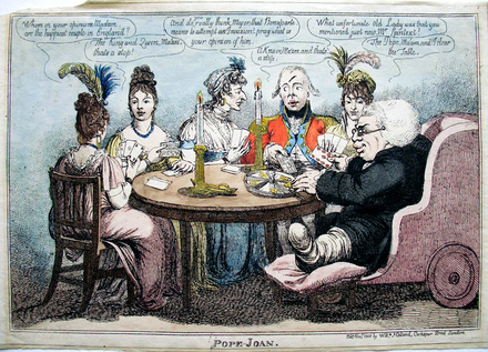
Charles Williams (active 1797-1830), Pope Joan, 1805. Hand colored etching. Graphic Arts Collection British Caricature GA2012- in process.

During the War of the Third Coalition (1803 to 1806), Great Britain was under constant threat of an invasion by Napoleon I (1769-1821). This is reflected in the game of Pope Joan print drawn by Charles Williams in November 1805.

One of the players asks, “And do you really think, Major, that Bonaparte means to attempt an Invasion? - pray what is your opinion of him.” To which the answer is given, “A knave Ma’am, and that’s a stop.”

AN00958259_001_l.jpg

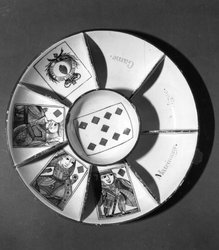
Pope Joan was a popular card game played in 18th- and 19th-century England. The staking board used in the game can be seen in this print, with its eight compartments labeled Ace, King, Queen, Jack, Game, Pope (the 9 of diamonds), Matrimony (the king and queen of trump) and Intrigue (the queen and jack of trump). The aim of the game is to run out of cards before anyone else does. For the complete rules, see http://www.boardgamesofold.com/pj_game.html

Gamblers Given Time on a Treadwheel

| 1 Comment
playing cards2.jpg

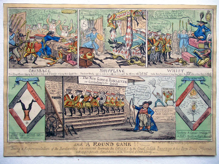
George Cruikshank (1792-1878), Cribbage, Shuffling, Whist, and a Round Game!! 1822. Hand colored etching. Graphic Arts Collection British Caricature GA2012- in process

This single sheet holds a series of caricatures around the raids held in October 1822 on London gambling houses, in particular around Pall Mall. The Bow Street Runners led by the Chief Magistrate Richard Birnie (1760-1832), seen in the upper right corner, closed a number of gaming houses although they did not stop “the synagogues of Satan” completely.

g09cs3s5.jpg
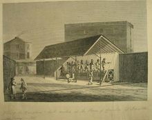
The gamblers were referred to as the Greeks or the black stockings. One punishment was to spend the day walking a treadmill. According to the Guildhall Library, at “the treadmill at Brixton House of Correction (1821) prisoners did ten minutes on and five minutes off the treadwheel. In some prisons, like Coldbath Fields, the treadwheel drove a flour-mill, but in others it did nothing at all. The work was done under the Silent System.”

See also: The Greeks; a Poem … Dedicated to All Legs! By the Author of the Pigeons, Fashion, &c. (London: J.J. Stockdale, 1817). Graphic Arts Collection (GA) Cruik 1817

Hellén, The Pigeons: Dedicated to All the Flats, and Showing the Artifices, Success and Crimes of Gaming, Gamesters and Gambling Houses … by the author of the Greeks (London: Printed for J.J. Stockdale … 1817). Graphic Arts Collection (GA) Cruik 1817.2

Charles Dunne, Rouge et noir: the Academicians of 1823, or, The Greeks of the Palais Royal, and the Clubs of St. James’s … (London: Lawler and Quick and Stephen Couchman, 1823). Frontispiece by R. Cruikshank. Graphic Arts Collection (GA) Cruik R 1823.4

A Royal Card Game

playing cards3.jpg

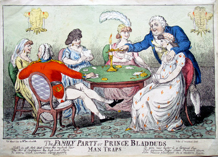
Isaac Cruikshank (1764-1811), The Family Party or Prince Bladduds Man Traps!!
May 11, 1799. Etching with hand coloring. Graphic Arts Collection GAX 2012- in process

AN00091651_001_l.jpg(c) British Museum

A card game is being played at the home of King George IV (1762-1830), Prince of Wales, who is standing with his hand on the breast of Honor Dutton (born Gubbins, married Ralph Dutton). His younger brother Frederick Augustus, Duke of York and Albany (1763-1827), is sitting with his back to us.

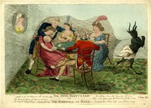
Cruikshank drew at least six caricatures of the two brothers and Honor Dutton. What’s interesting about this one is that a very similar print, titled The Snug Party’s Exit. Or the Farewell to Bath was published on May 6, 1799 by J. Brown of Bath (probably a pseudonym). In less than a week, Cruikshank completed a pirated copy, with the image laterally reversed. This was published in London by Samuel William Fores (1761-1838), a dealer who specialized in playing cards and popular prints.

The print’s title refers to Prince Bladud, a legendary king, who was banished from Athens when he contracted leprosy. He was miraculously healed by the waters at Bath and went on to founded a city at that site (at least that’s one story).

Recent Comments

  • Howard Coblentz: I have a round seal shaped like a pear a read more
  • John Overholt: Wikipedia's entry for Sir Francis says: "Throughout Baring's lifetime his read more
  • Serge Rodrigue: It is a precious thing you have a book from read more
  • Colin Wicks: I have a copy of “A Round Game.” And it read more
  • Laurence Hilonowitz: I was a Customer, Friend of Bob Wilson. I Live read more
  • allen scheuch: Absolutely STUNNING! Those colors, those designs made my day! Thanks, read more
  • Olivier: Hello Diane, If you are still looking for an examplare read more
  • Stella Jackson-Smith: I have a framed picture by A.Brouet, signed with the read more
  • John Podeschi: I remember Dale fondly from my days at Yale (1971-1980). read more
  • Joyce Barth: I have some or all of this same poem. I read more